Synergy
Design and Words by IDr. Jeselyn Chuan
Project location: Private residence in Quezon City, Philippines
Floor Area: 160 square meters
Inspiration
Our inspiration always stems from an understanding of the client’s needs and vision for the space. The space was originally a 1970s residence that the client wanted to convert into a mixed-use space for residential and business purposes. The main design challenge was creating a space that feels fresh and new, while considering the presence and limitations of the existing structure. The goal was not to create a “dream” space, but to repurpose the old structure while updating the space’s visual and construction standards.
Thus, the project became a synergy of the old and new, order and chaos, lines and curves. We wanted to let the original structure co-exist together with the new elements to give a deeper meaning and value into the design. The overall style is very minimalist to highlight modernity and functionality in its rawest form.

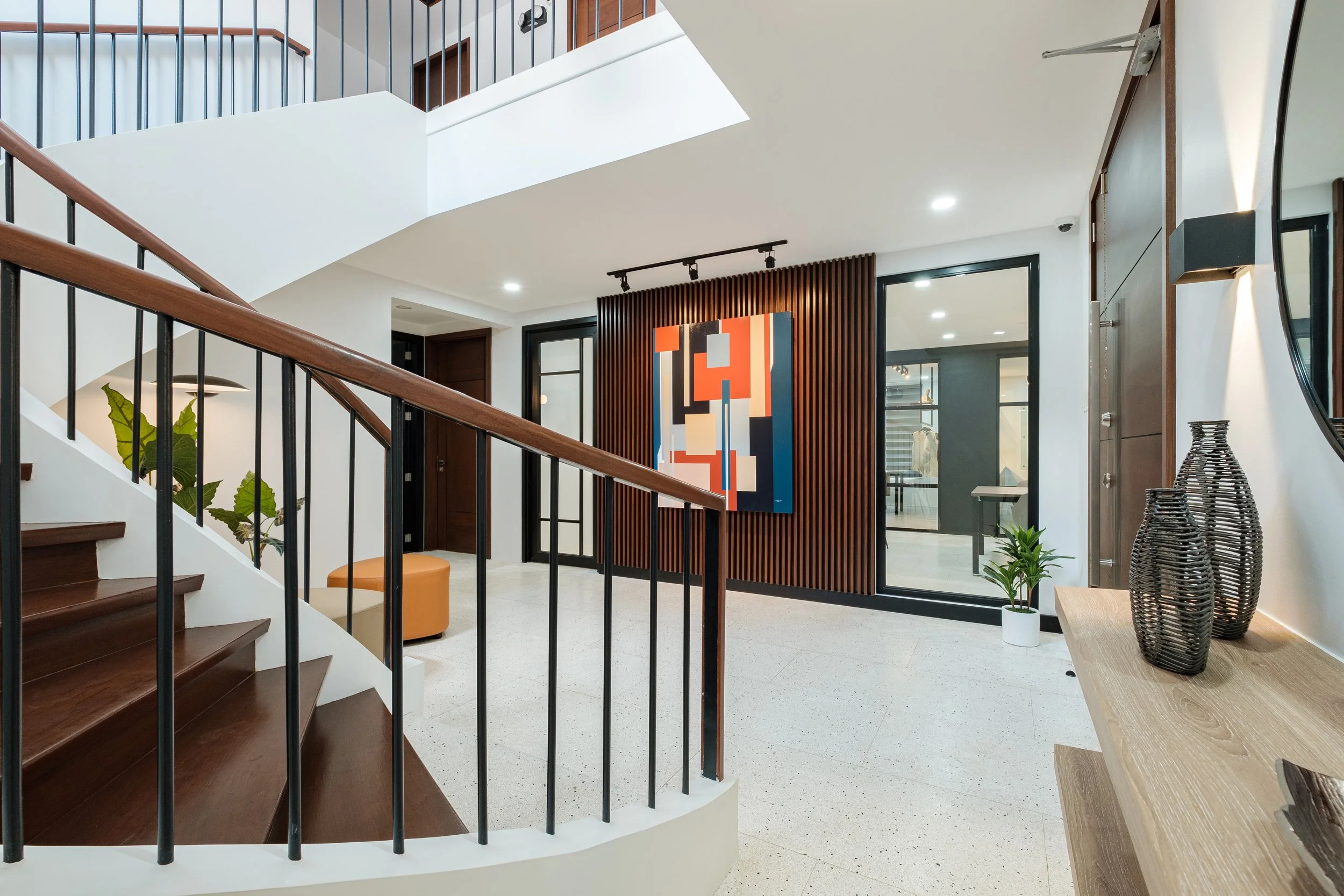
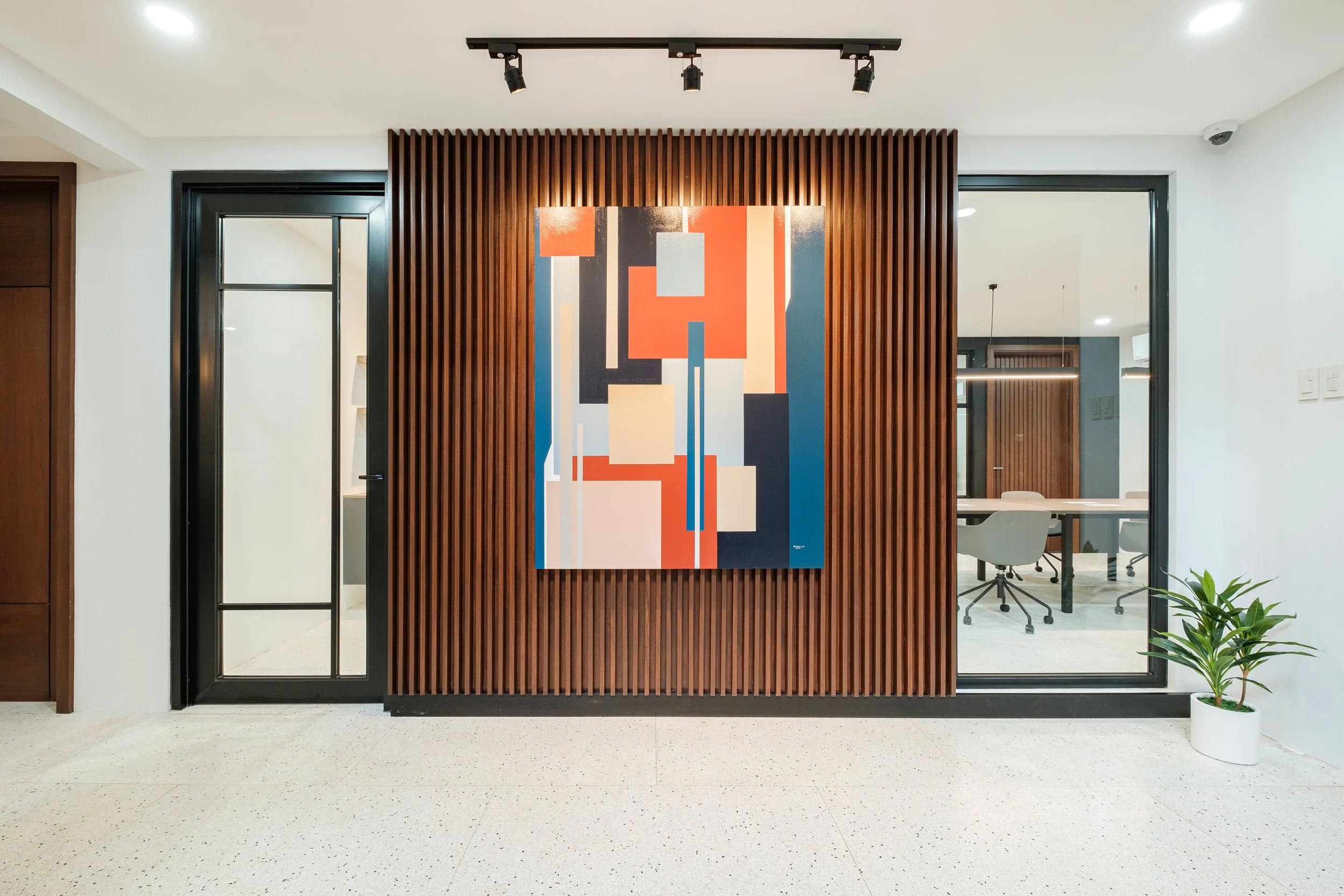
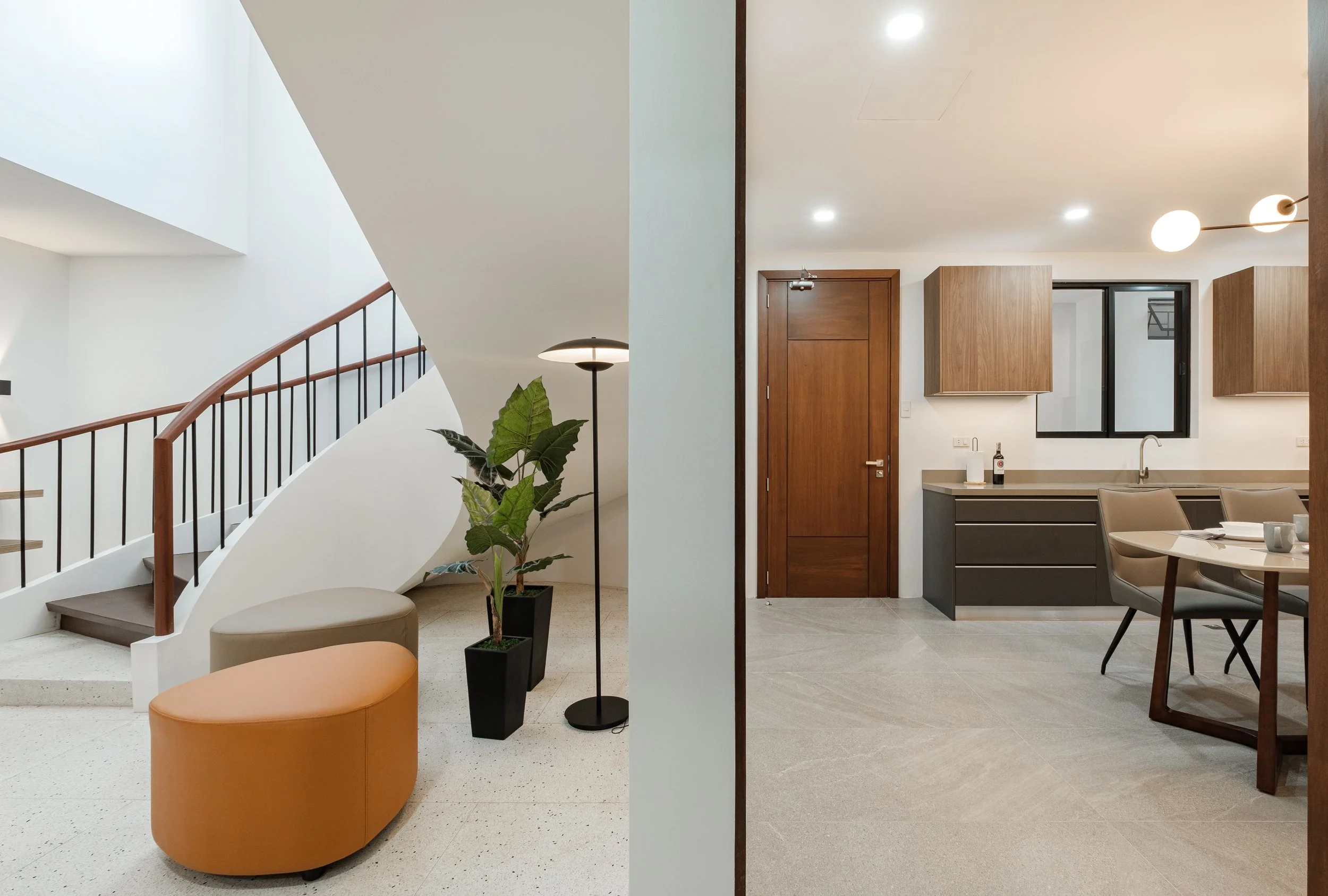
Foyer
Welcoming the space is a new feature wall with wood slats and a commissioned painting entitled “Synergy” which encompasses the theme of the space: co-existence of opposites like order and chaos, old and new, and a prominence of lines and shapes.
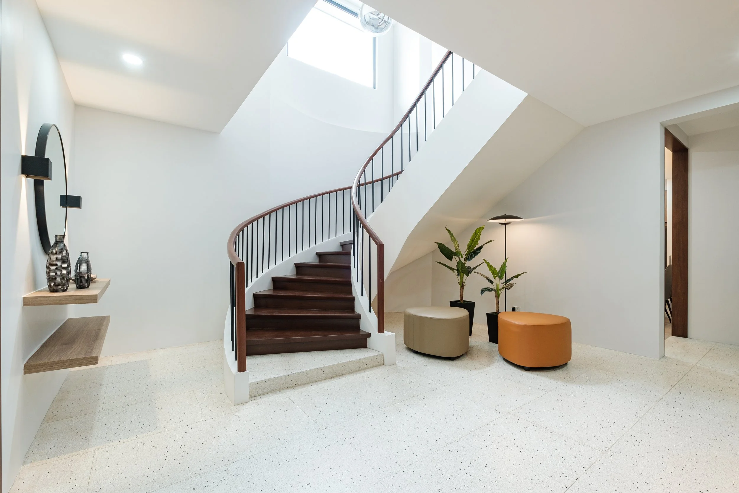
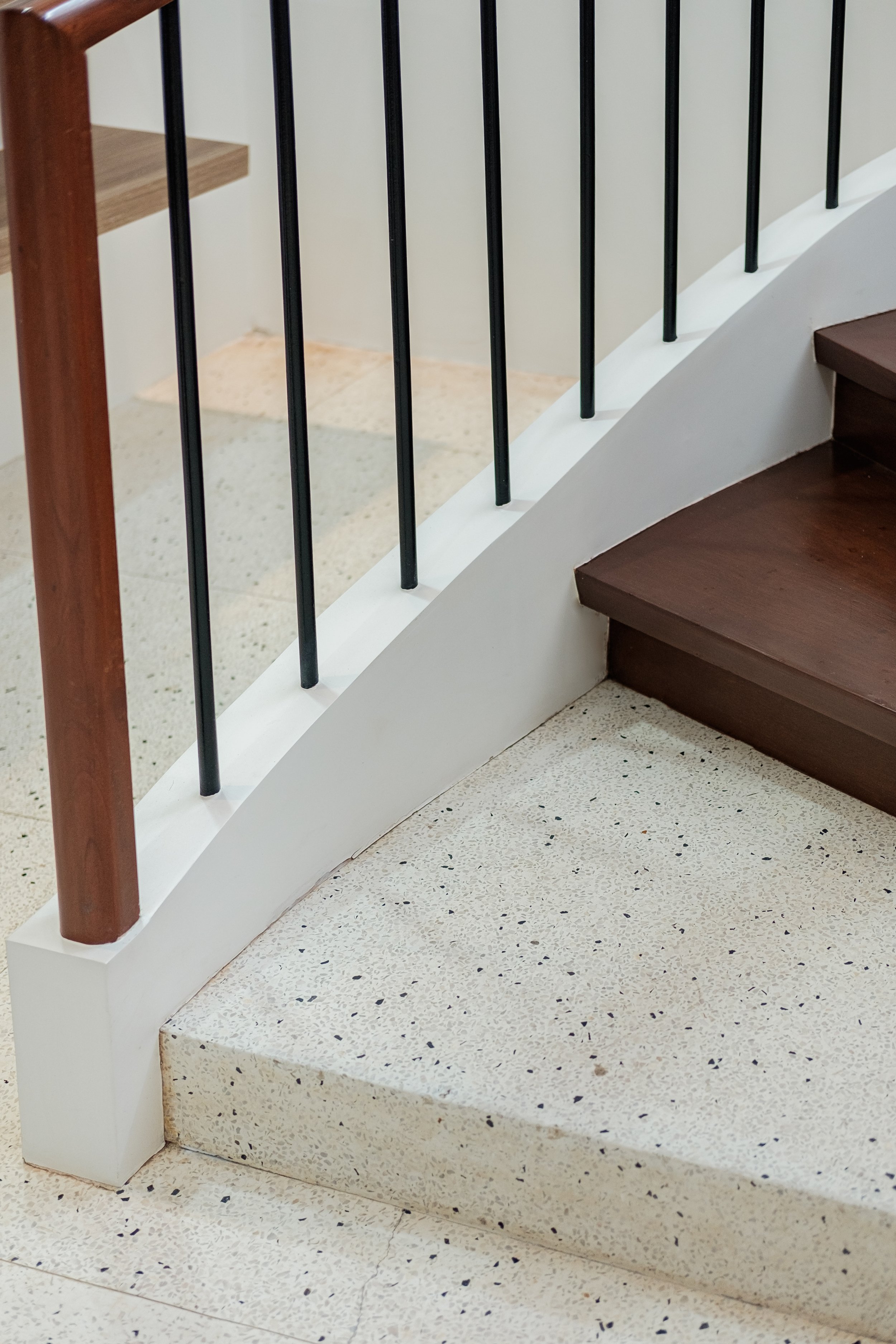
On the left is the refurbished 1970s staircase updated with a clean, curved side stringer, metal balusters, and a smooth wood handrail. We were able to retain a lot of the original structure like the stair form and terrazzo flooring that immediately hints to the rich history of the space.
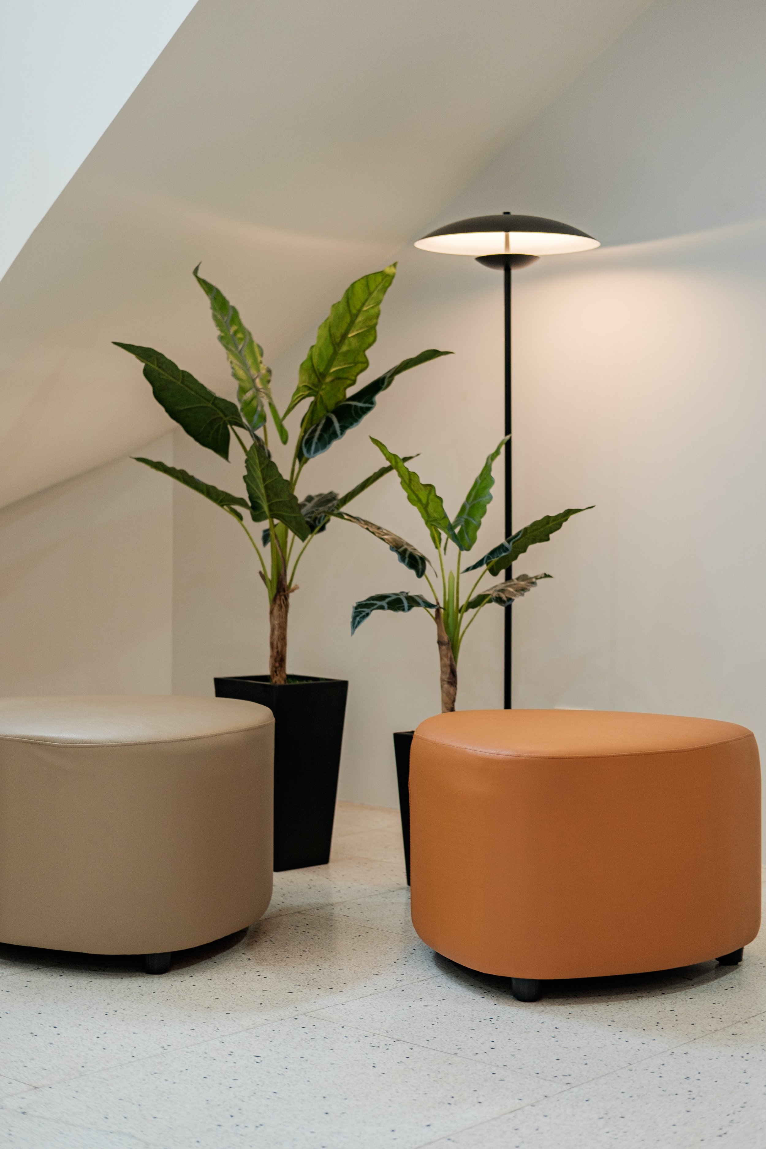
The original terrazzo flooring, resembling the stone grounds of a Zen garden, inspired us to create a little lounge area just below the staircase. We tried to bring a little of the outdoors into the space by adding pebble-shaped ottomans, indoor plants, and a floor lamp that glows like a garden lantern.
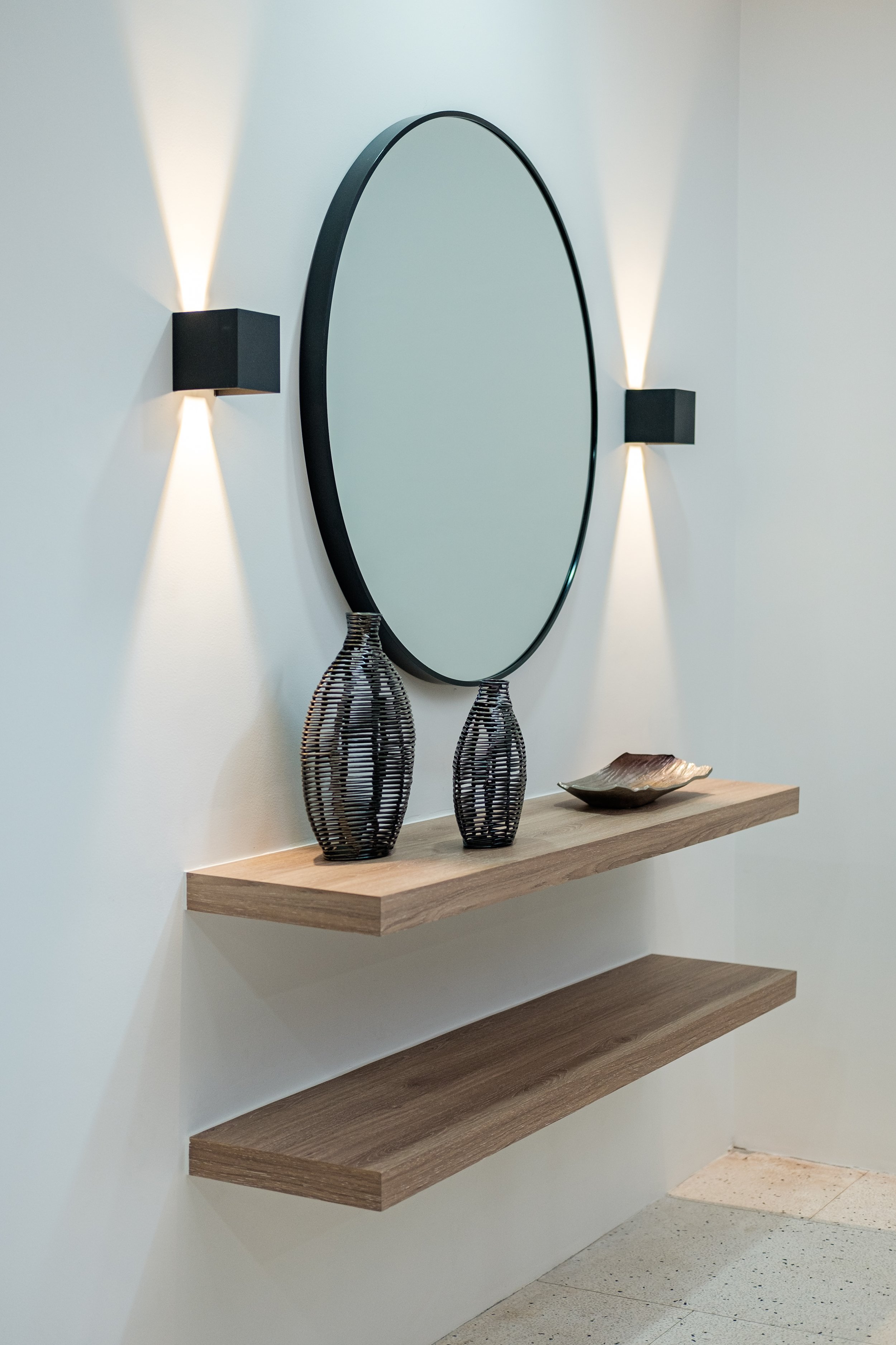
The foyer is completed with a simple vignette composed of built-in ledges, decorative mirror, and accent lighting that serve as a welcome console and sanitation station.


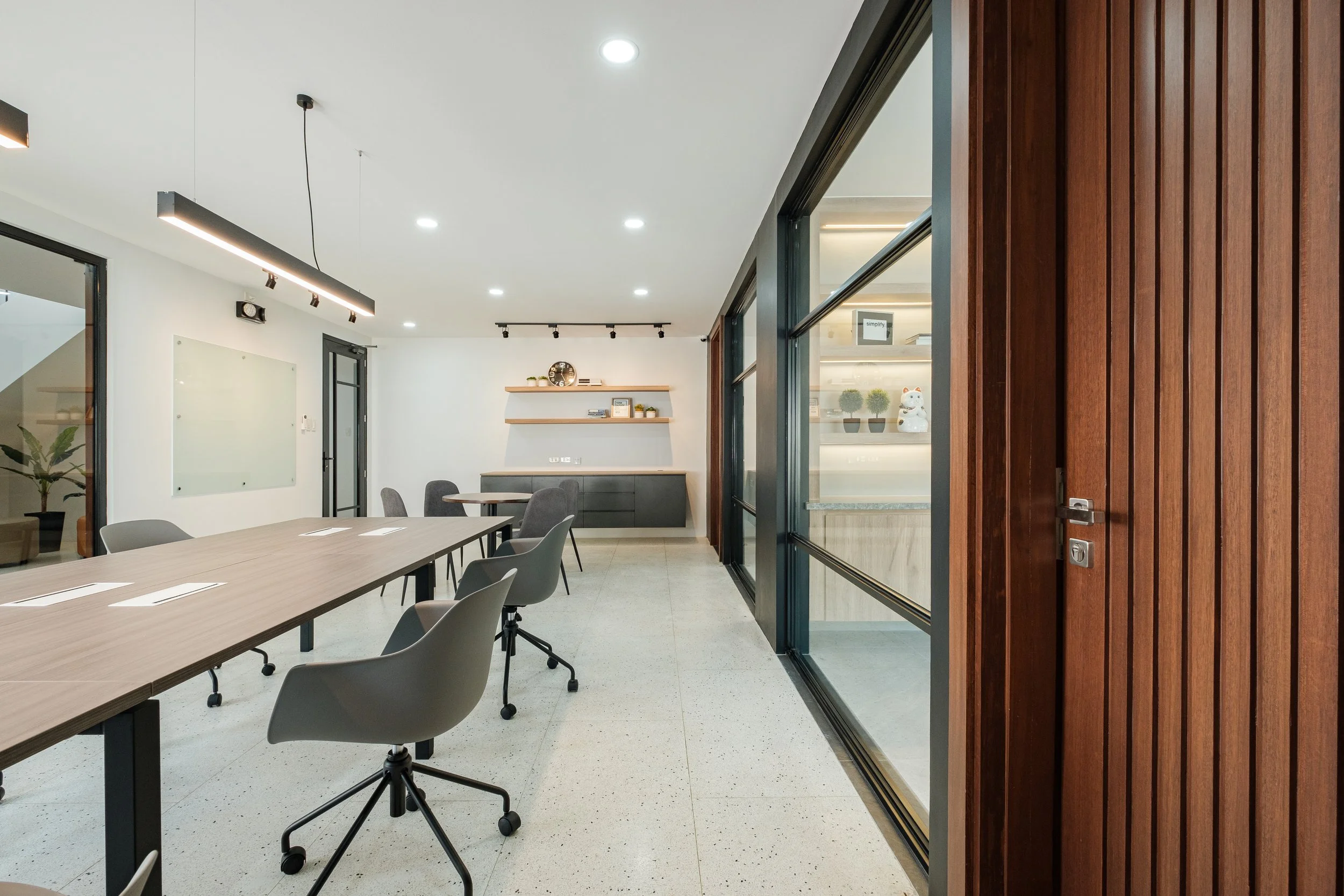
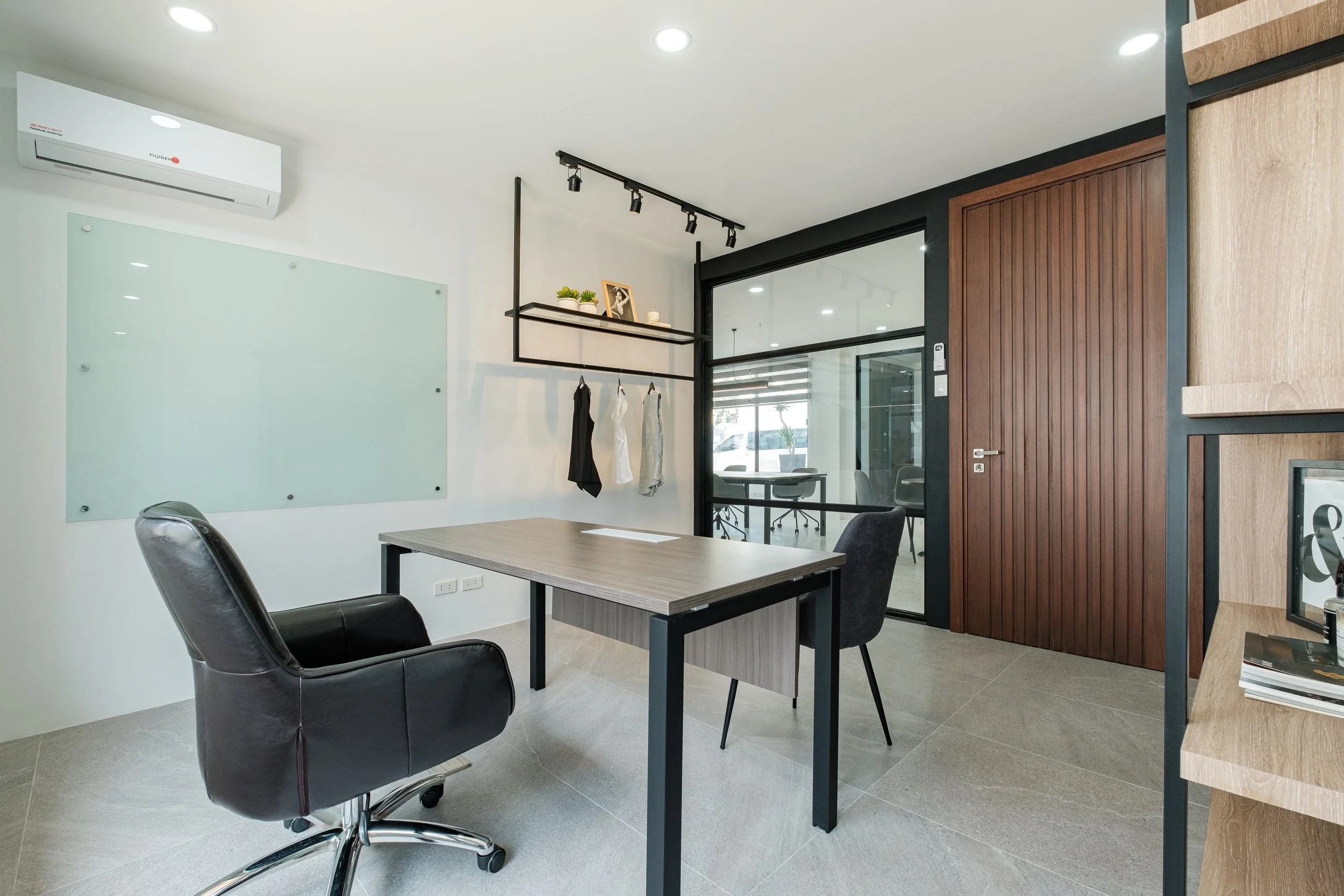
Main Office
The whole main office used to be the living and dining area with rooms and a T&B on the side. By re-purposing the space for business functions, we needed to rethink the lay-out and align it with their business process and needs.
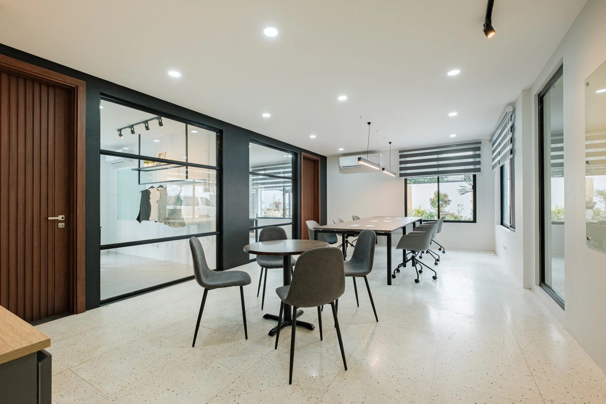
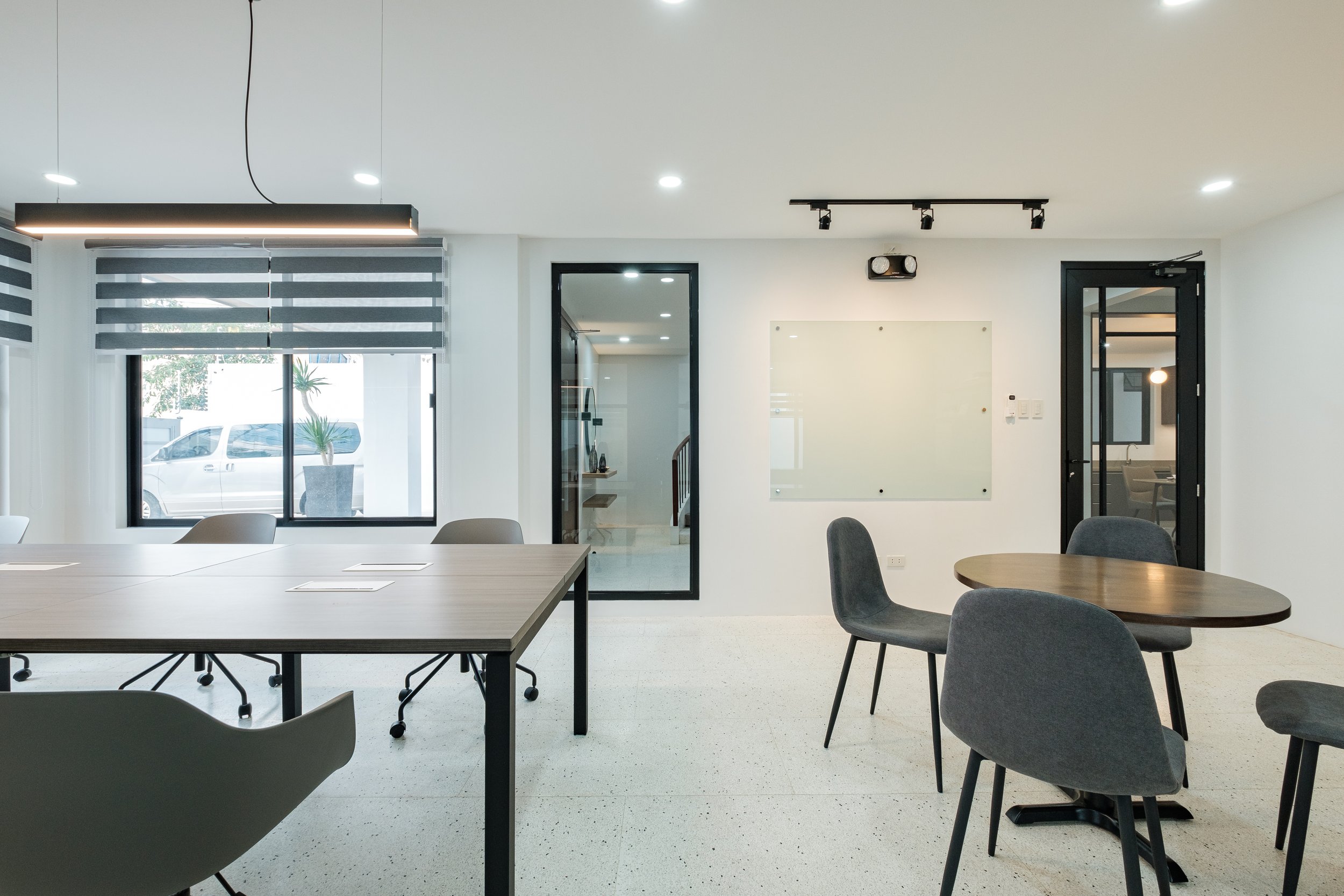
The main office is very linear and minimalist with prominent lines as the key element. We kept the walls bright and airy to be conducive for work and chose furniture with muted colors and modern curves. The lay-out is patterned after an open-plan, co-working space that is balanced between fun and professional.
The focal feature of the space is the glass divider separating the common area from the private offices. It acts as a distinct backdrop for the common area and a point of visual interest by being the only wall in a full-blown color. We incorporated a viewing glass to monitor work hours, aid communication, and add depth to the space. But we also designed solid, slatted doors for the private offices to add an air of privacy and excitement when entering the respective rooms.
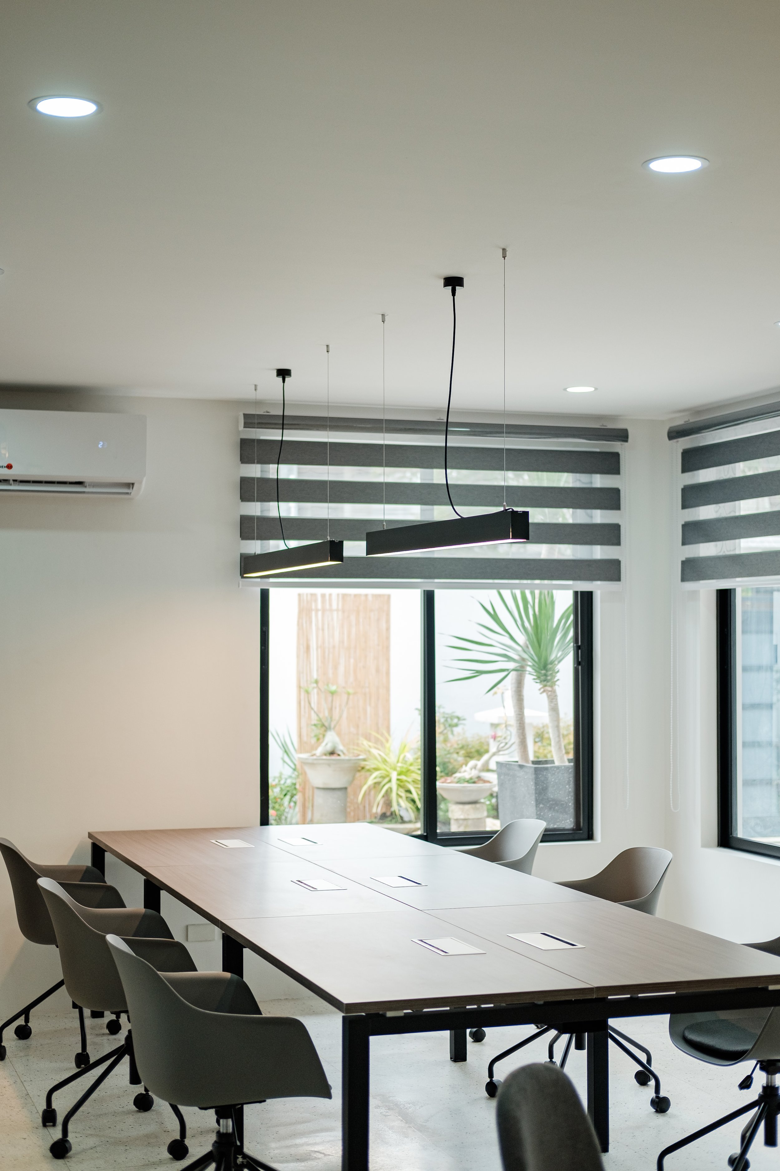
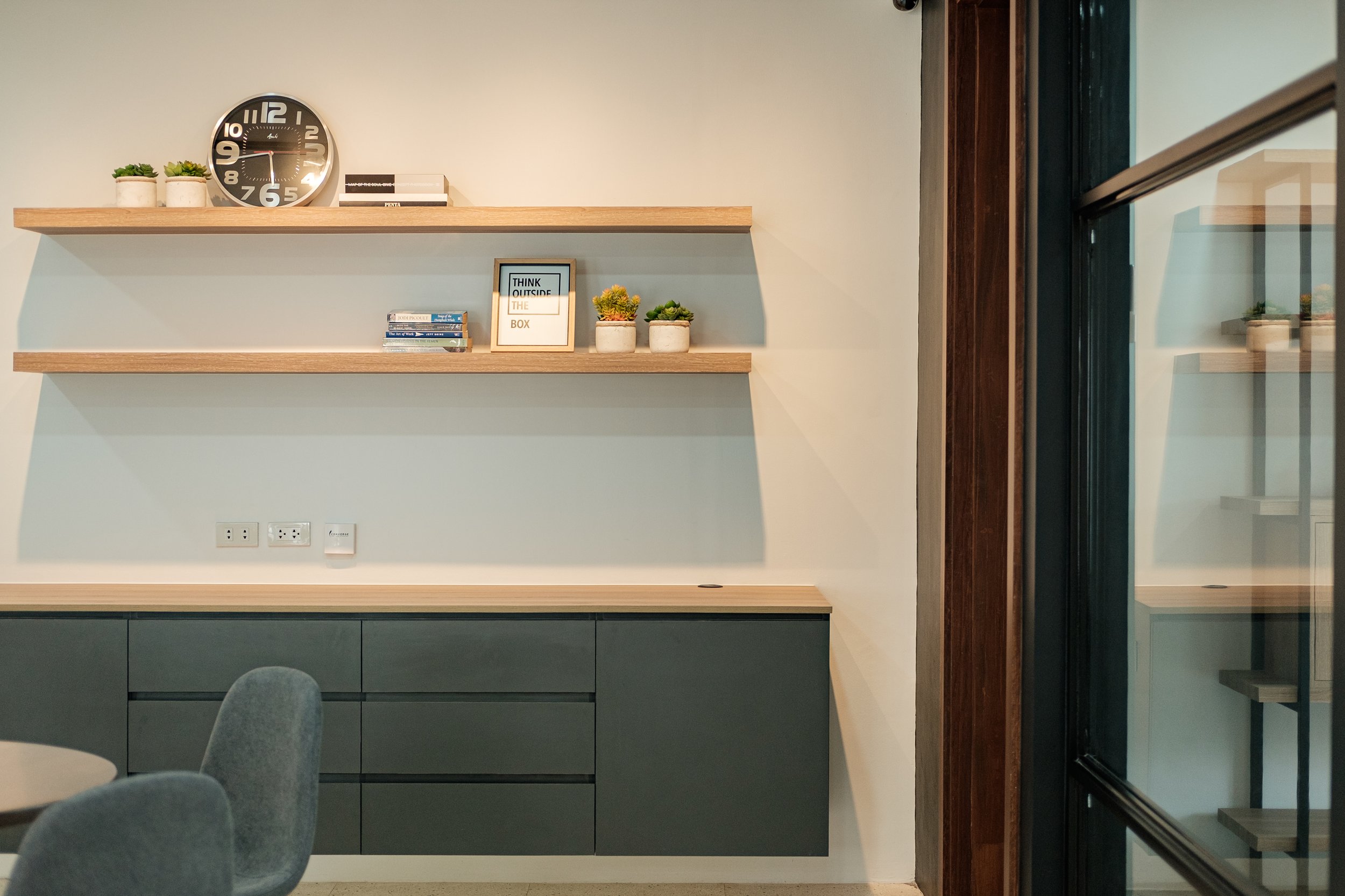
The main staff desk is oriented near the window where you have a view of the garden and a healthy amount of natural lighting during work hours. Since we also retained the terrazzo flooring, convenience outlets are strategically placed along the walls for easy access.
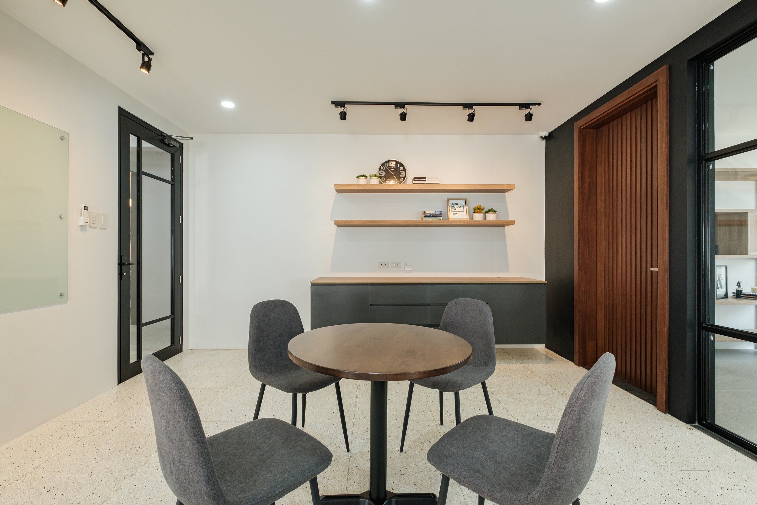
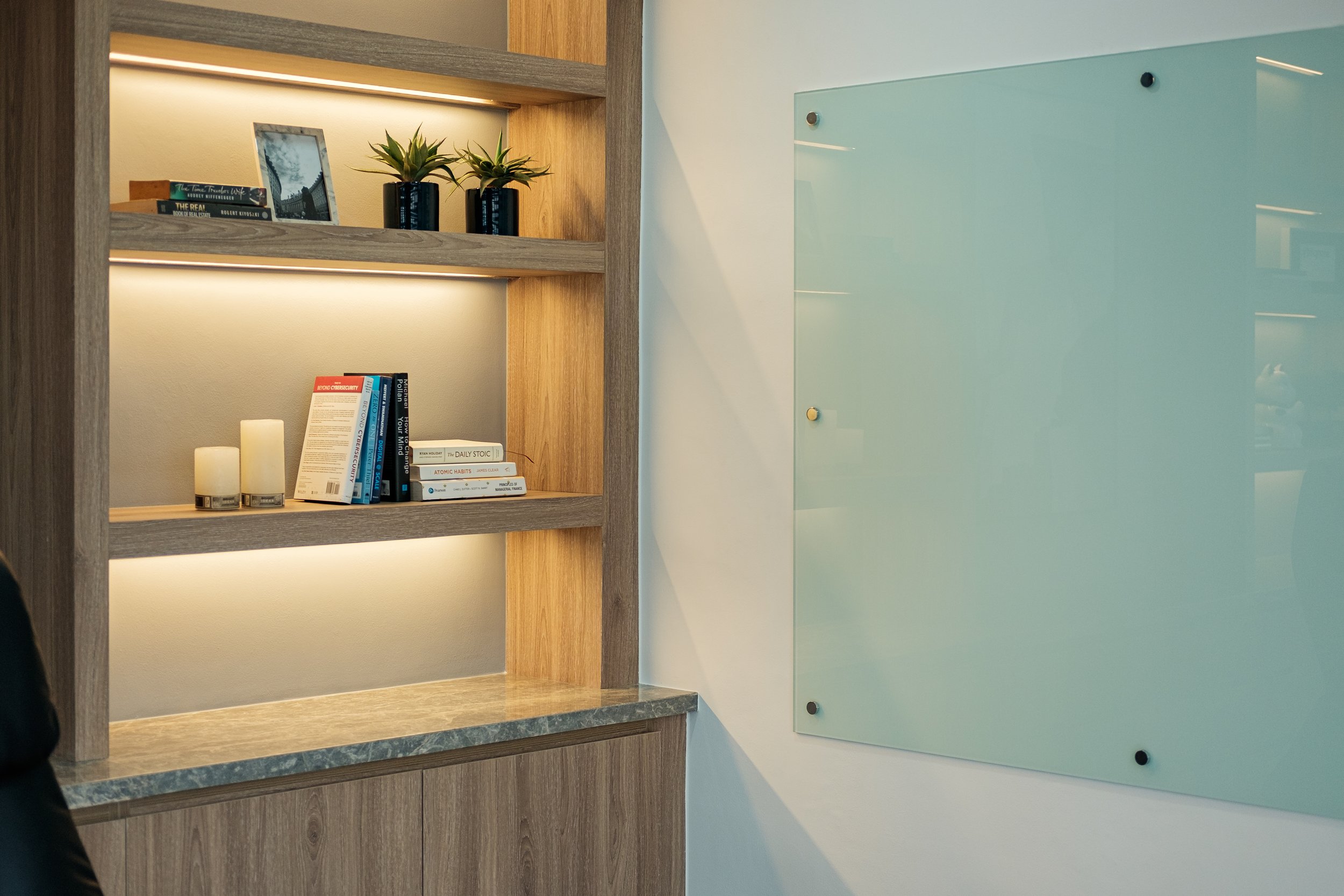
We also added a round table for client meetings, group discussions, or a short coffee break. It sits directly in front of a glass board where staff can write reminders or discussions during meetings.
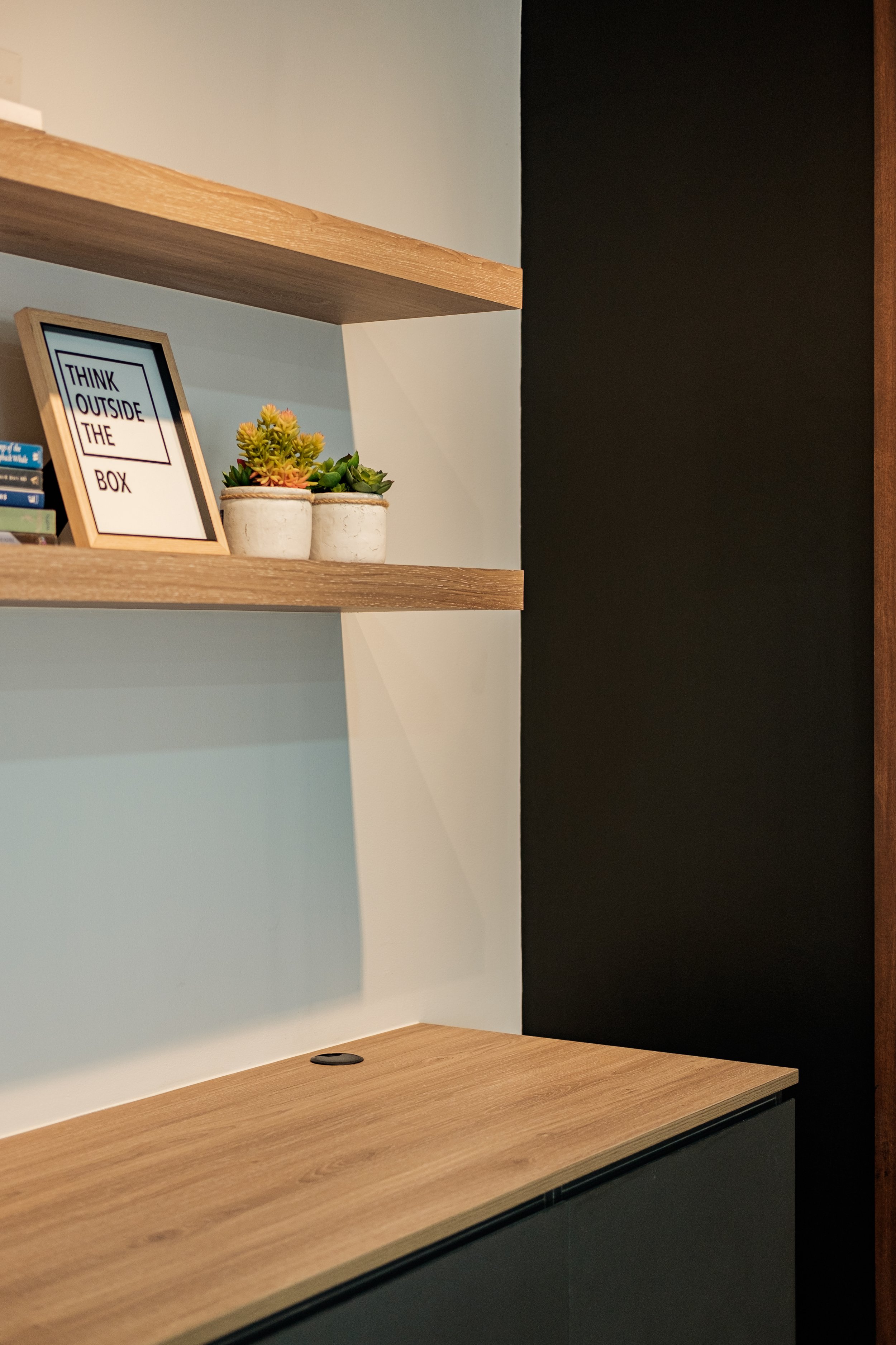
On the far end of the stretch is the IT and print hub where utilities and office appliances are designated. It also doubles as a storage and display area where the staff and team can slowly fill with their brand’s identity.
Despite the pandemic, the client did not want a cubicle lay-out as their business process is more creative and collaborative, thus this open lay-out allows them to be more flexible and adaptable for future improvements.


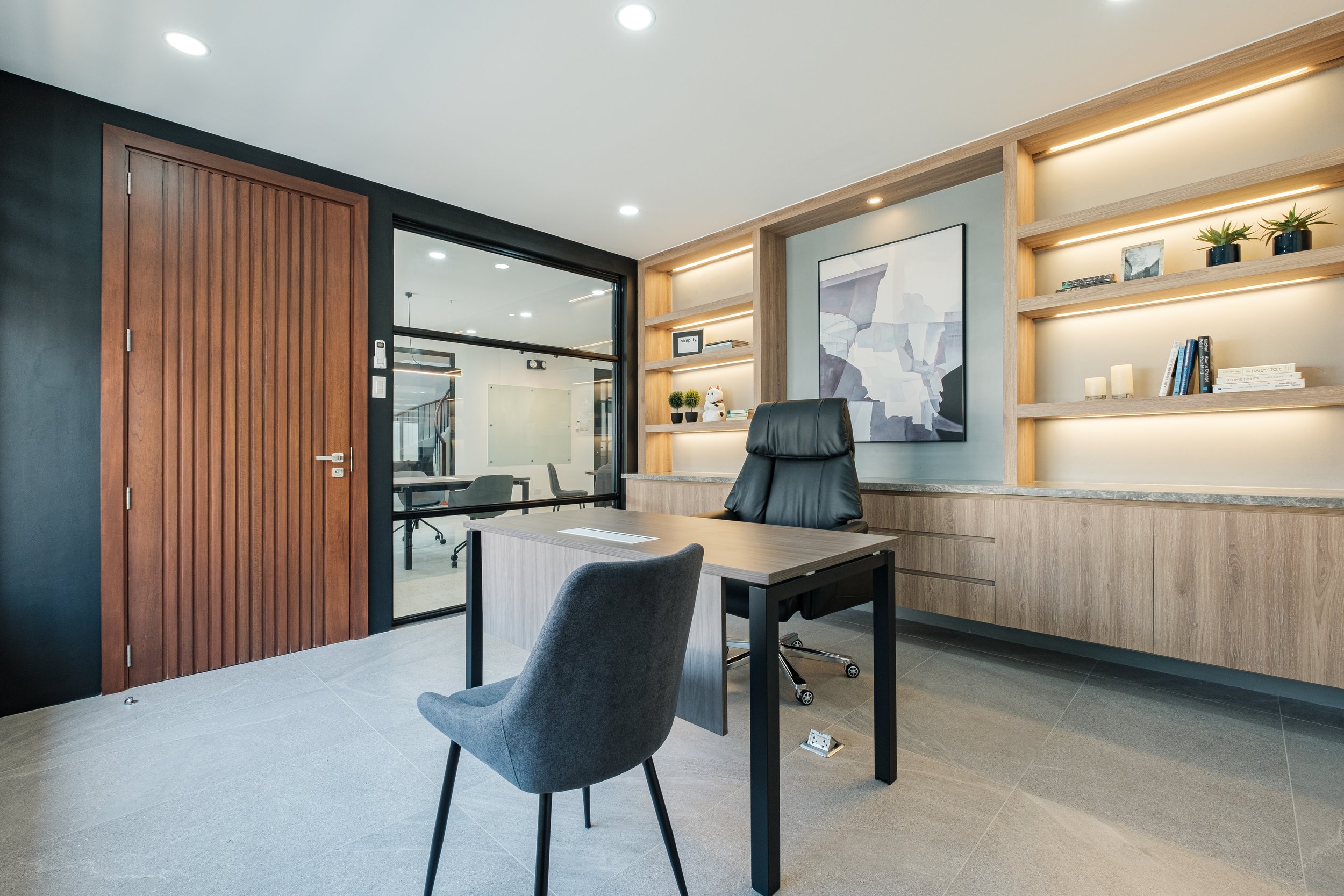
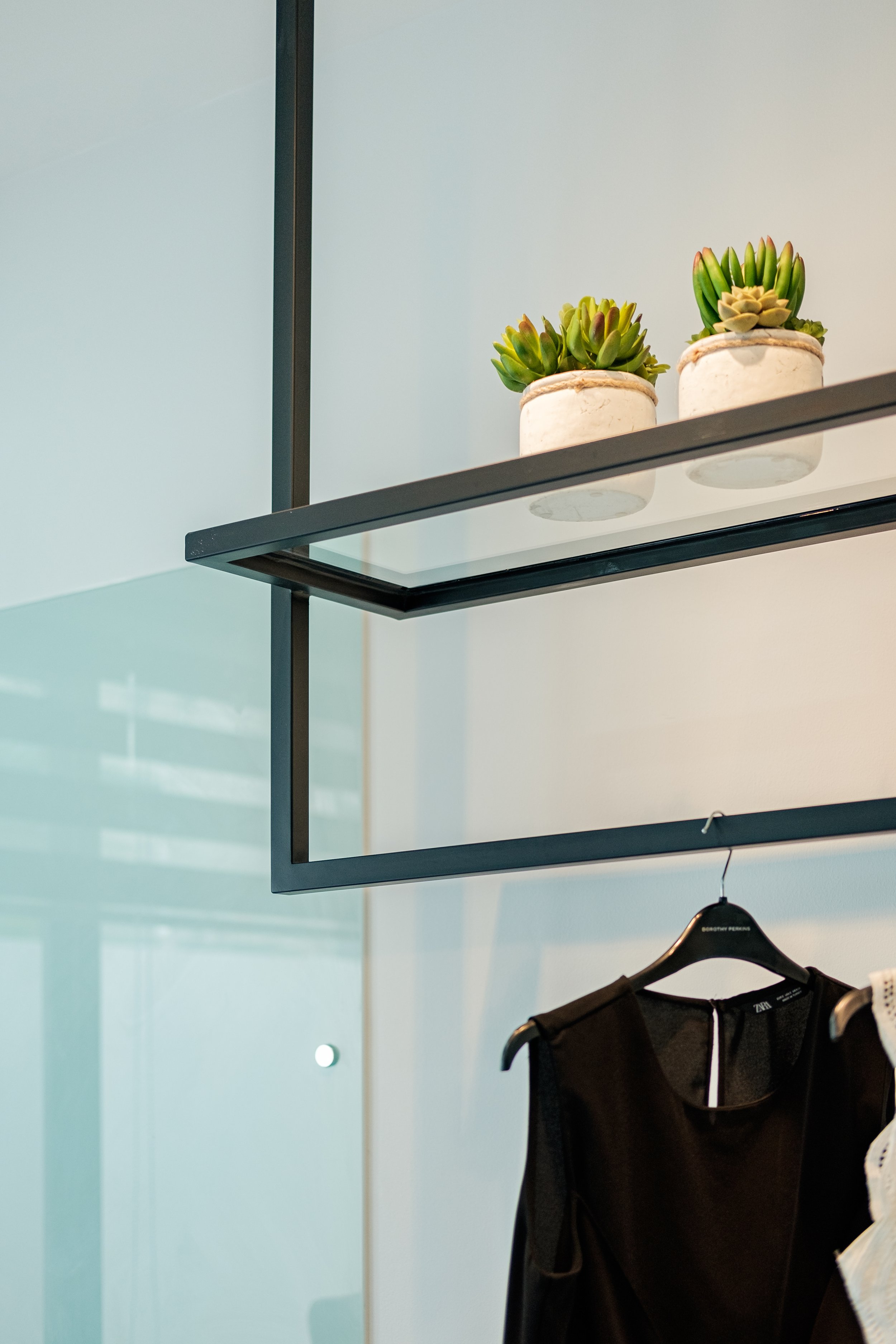
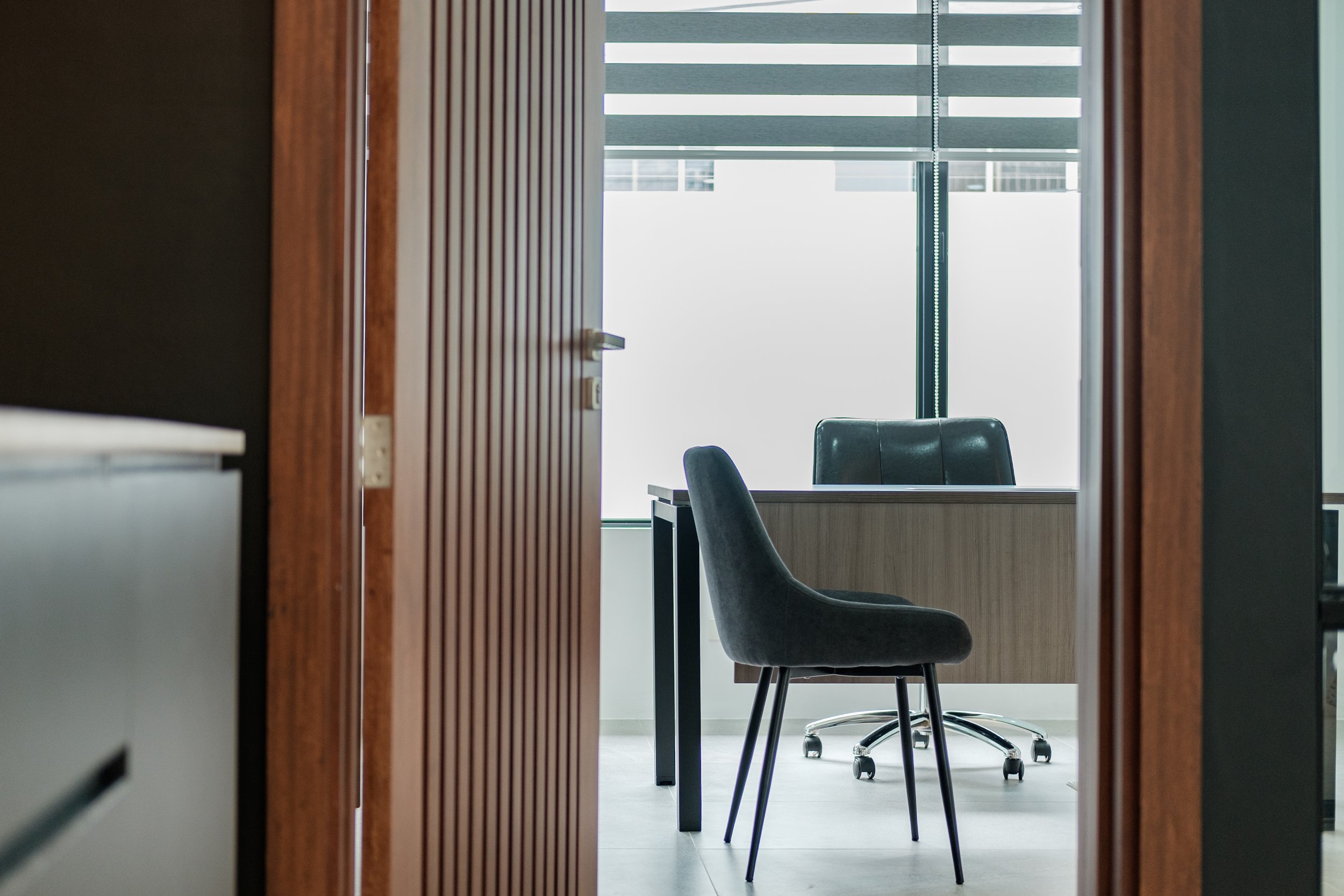
Private Office 1
Upon entering the private office, the feature wall is the first thing that captures your attention. The palette of the private office is calming with a mix of grey-brown wood, leather, and cool grey sandstones. The design is very linear and gives off a strong and stable atmosphere, and this linearity is highly contrasted by the abstract wall art in the center.
This feature wall serves as the backdrop for the executive desk that is oriented towards the window. This orientation is a primary consideration based on fengshui; and this gives the executive a refreshing view of the garden and a good peripheral view of the common work area outside.


Private Office 2
The second private office also reflects the same color palette and material choices, but we designed it to feel levels lighter and more casual for the creative executive.
The storage feature is freestanding with a play on open and closed spaces to give them freedom in styling the shelf accordingly.
Close to the viewing window, we also incorporated a display rack for studies and samples, new collections, or immediate client viewing.


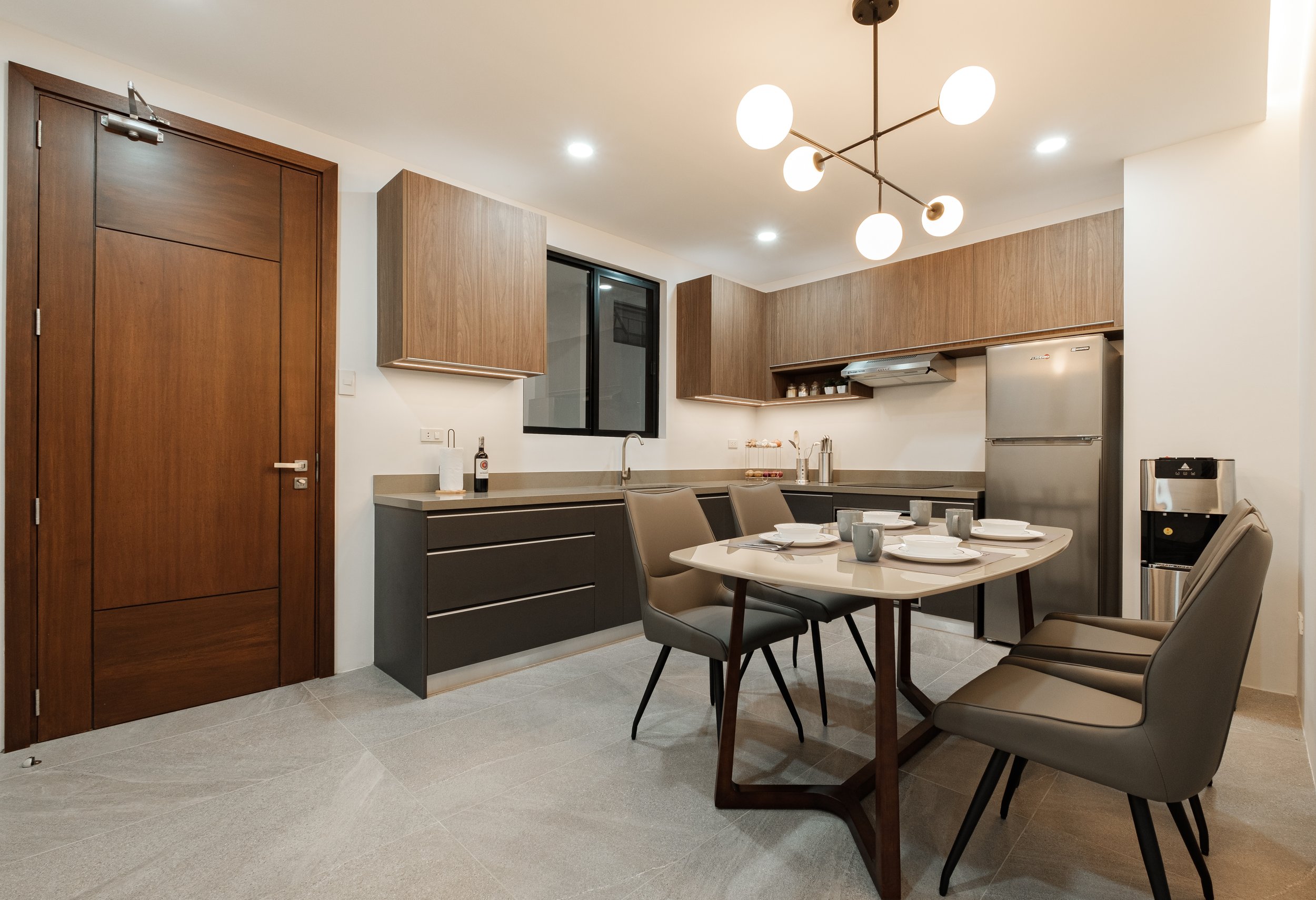
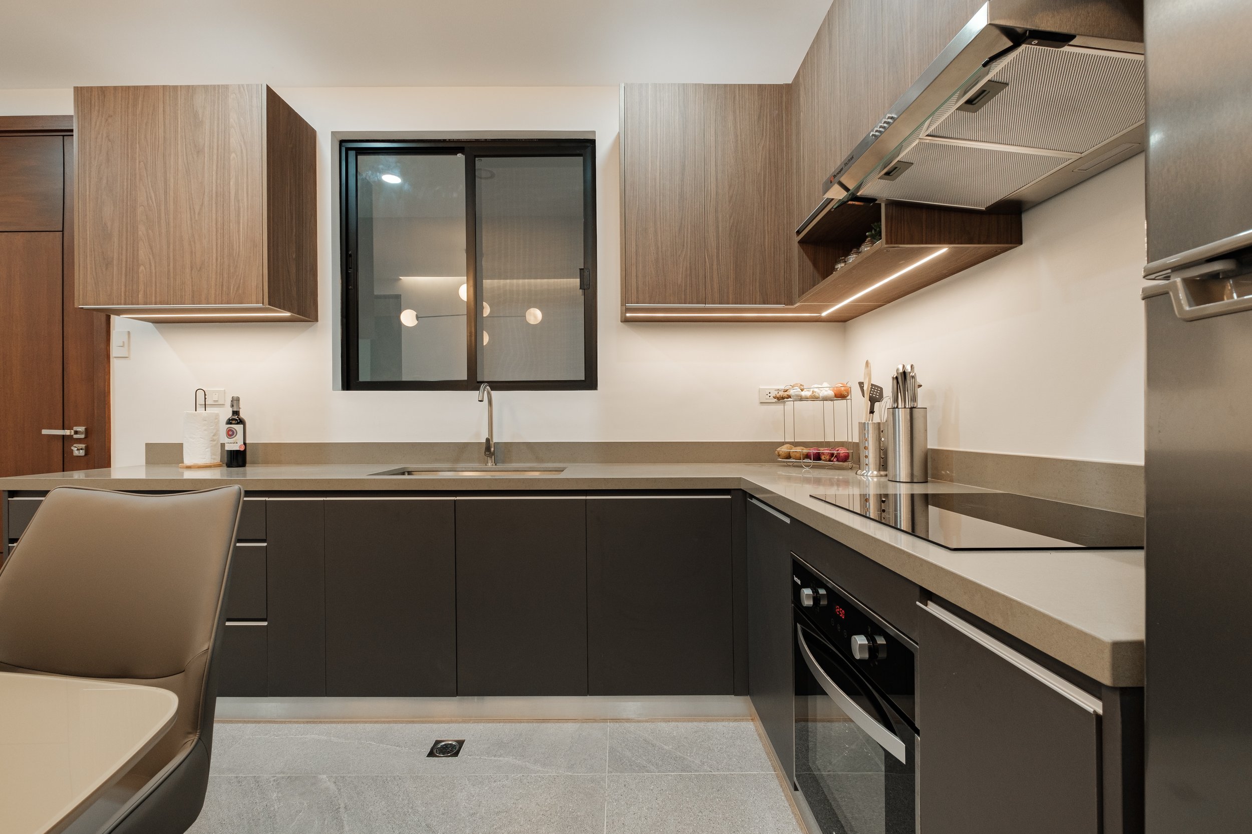
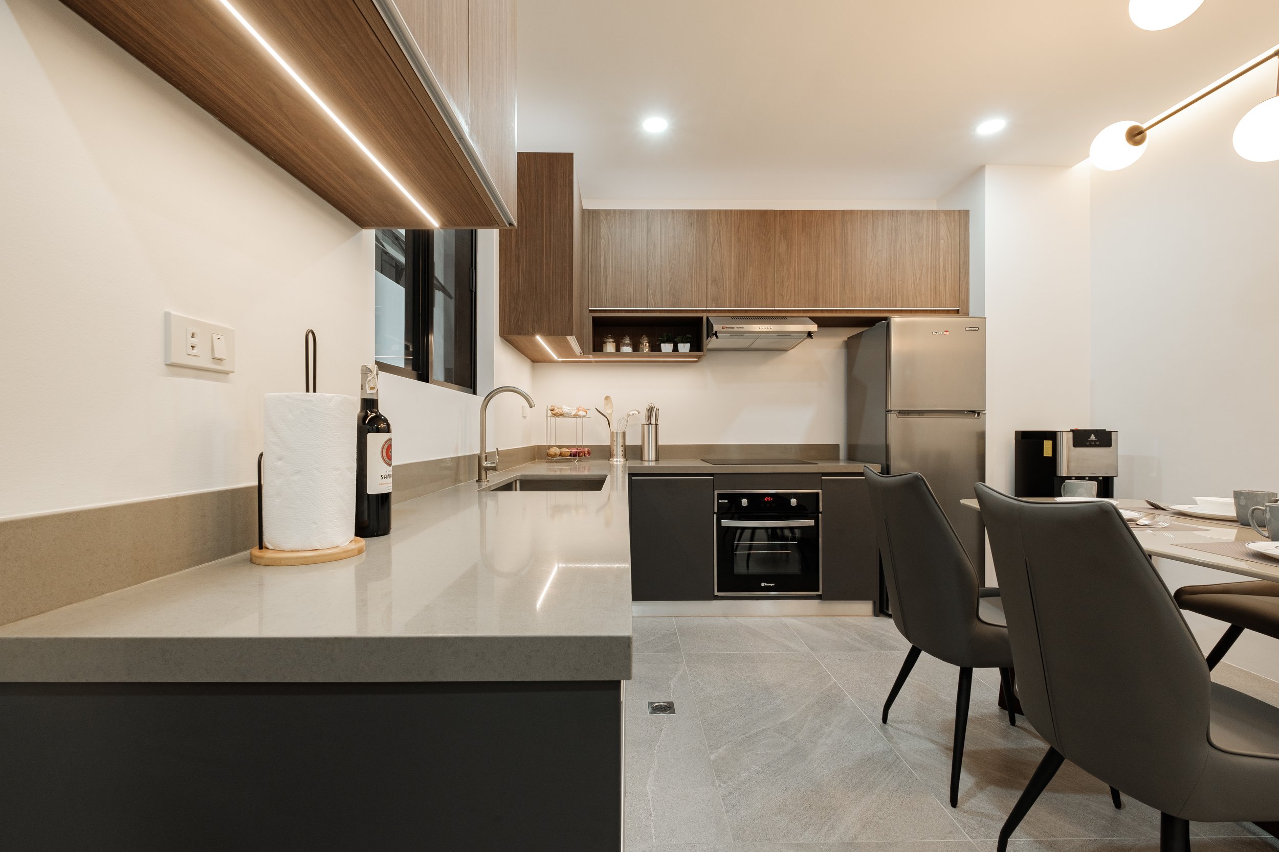
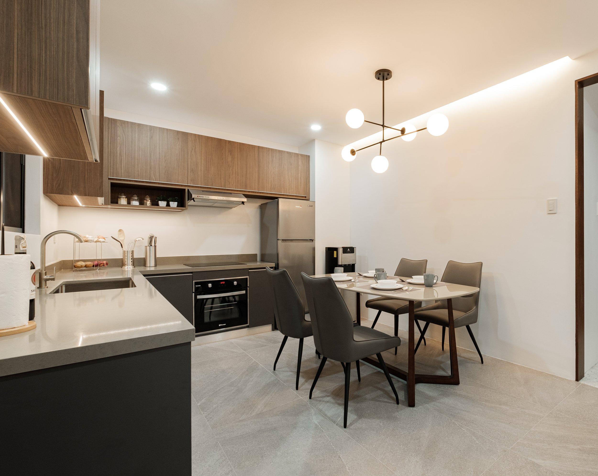
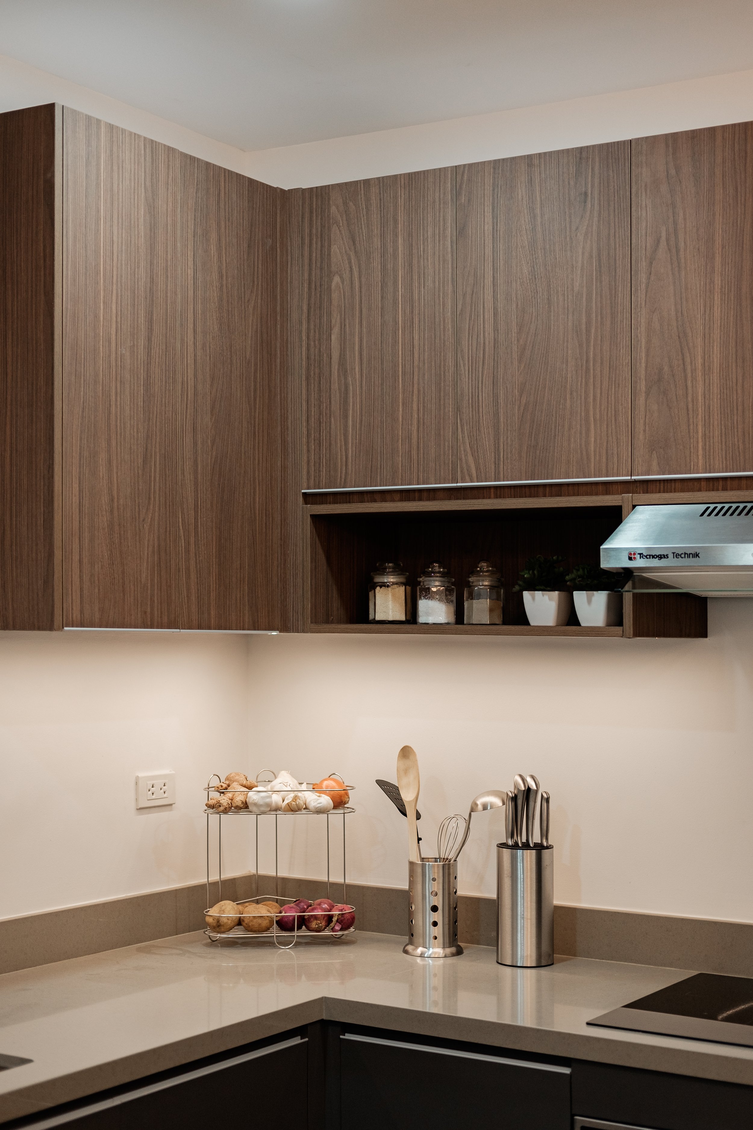
Kitchen and Pantry
The kitchen embodies a minimalist yet masculine vibe with dark wood, charcoal grays, and sandstone texture. It is a simple space with maximized storage for light preparations, basic cooking, and reheating of meals.
A 4-seater dining table is also incorporated into the space for light snacks and meals. We used a combination of muted warm and cool grays in different textures to make the space interesting in a very subtle way.


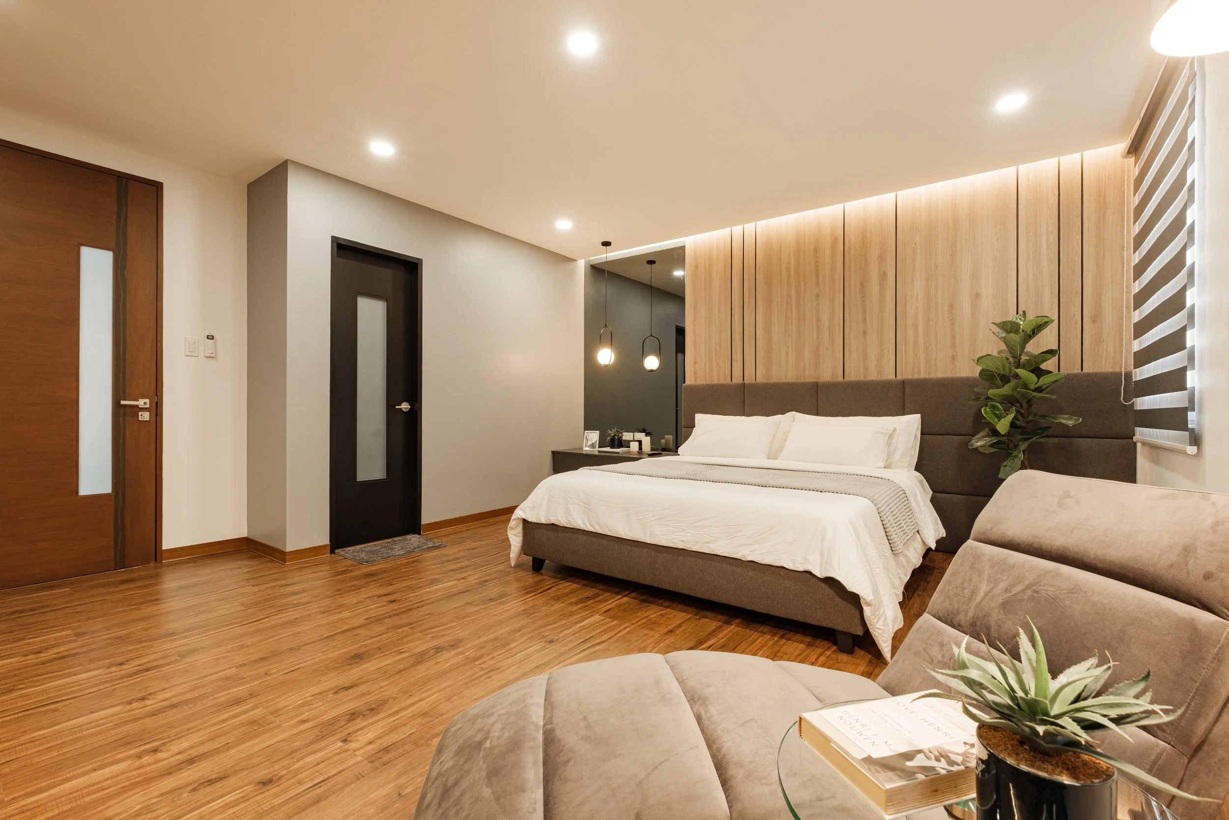
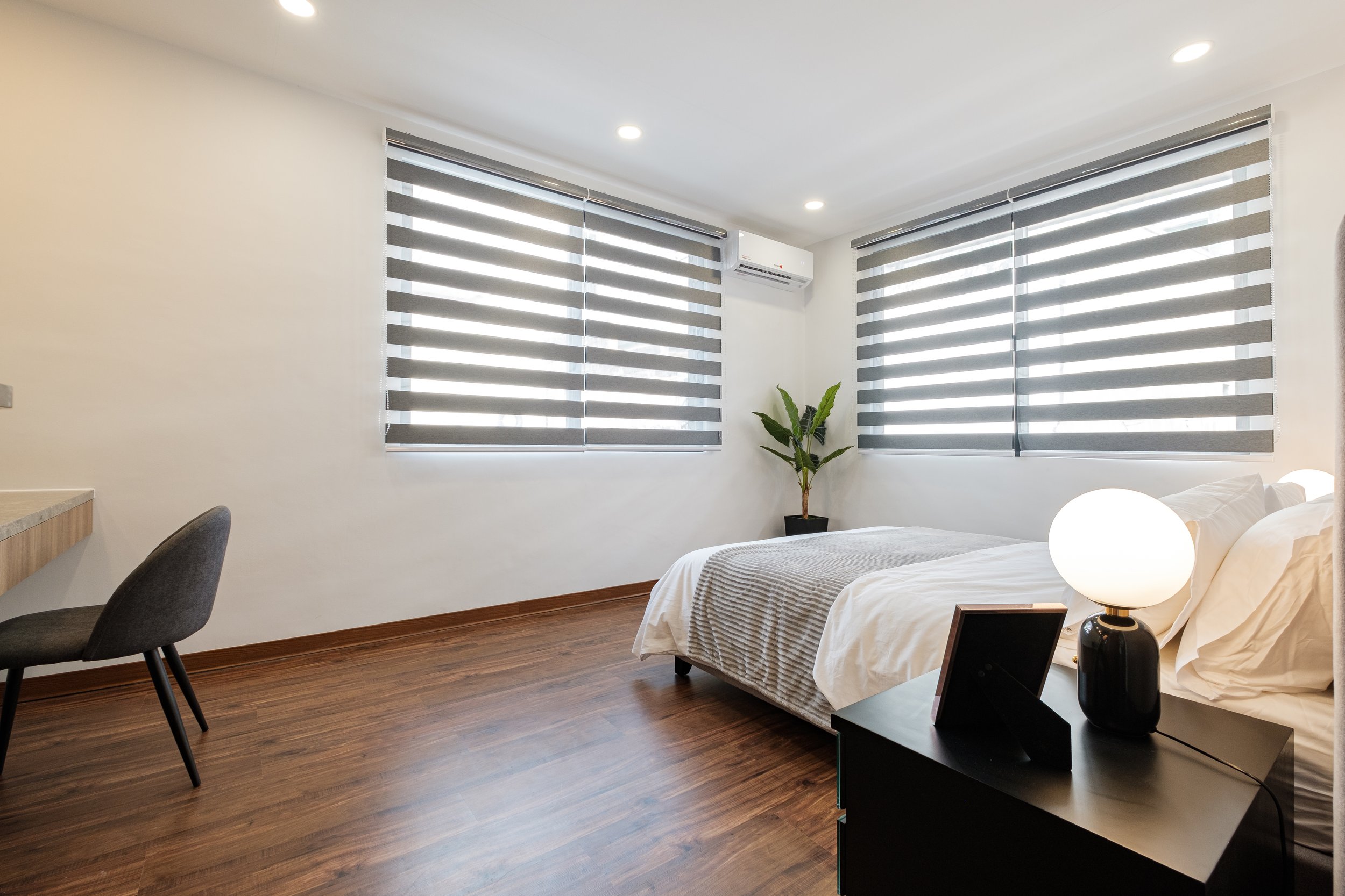
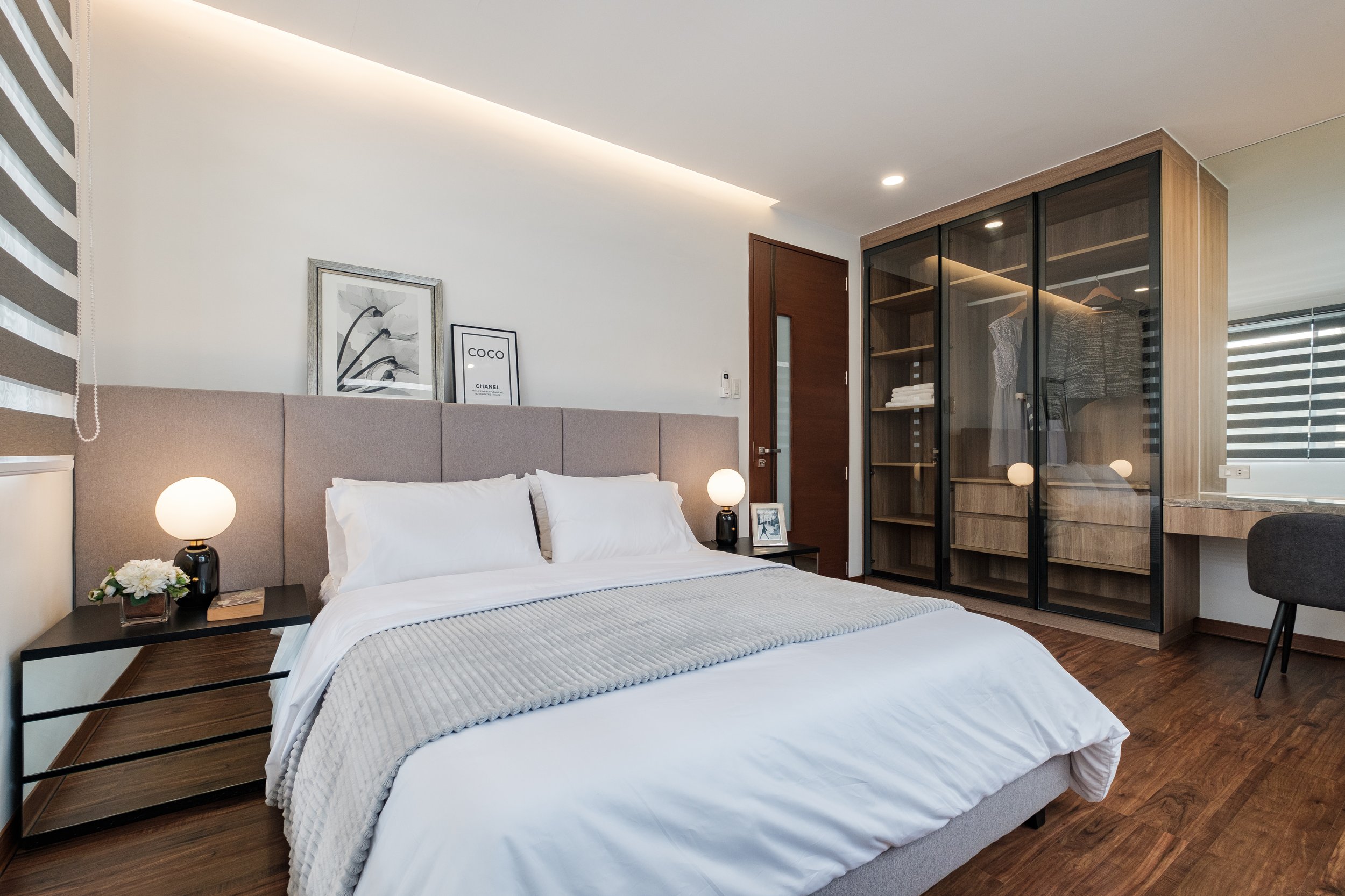
Master Bedroom
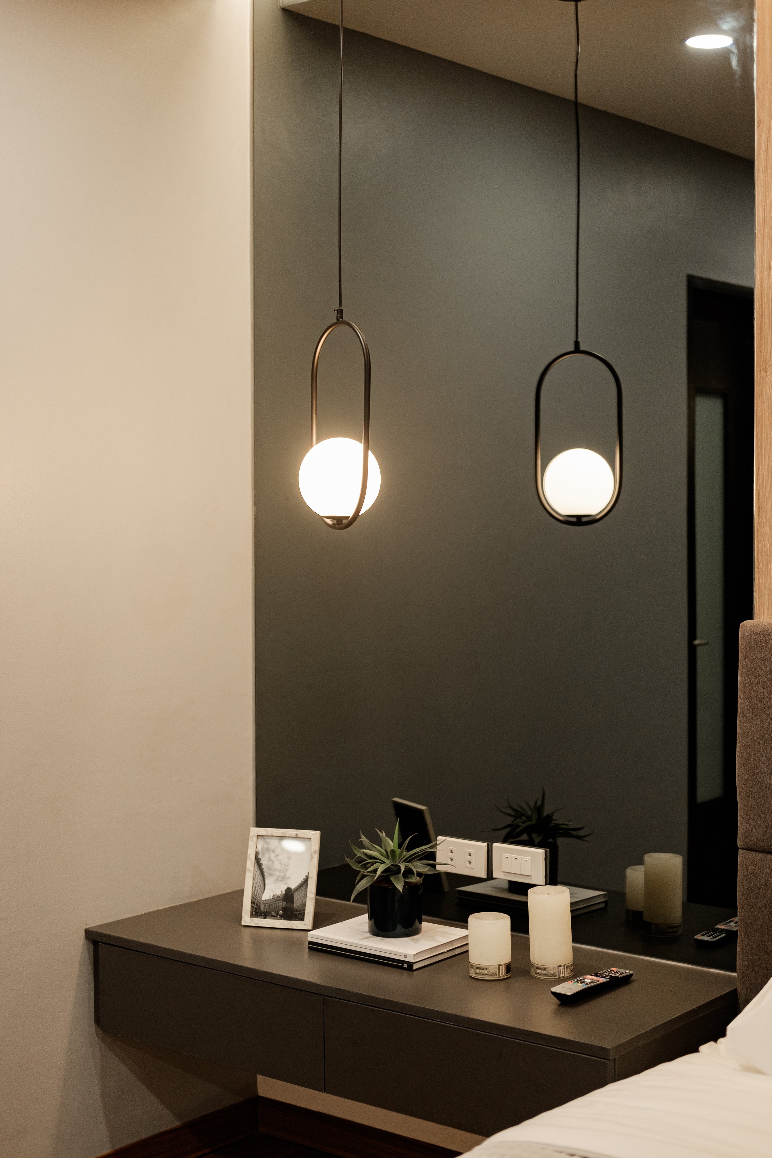
The master bedroom is designed with a modern, minimalist bachelor in mind. The main headboard view is composed of an asymmetric design highlighted by the use of contrasting elements like the reflective grey mirror, matte wood cladding, and soft fabric headboard. We used asymmetry to create drama and a sense of flow from the droplight falling from the ceiling to the potted plant rising from the floor.
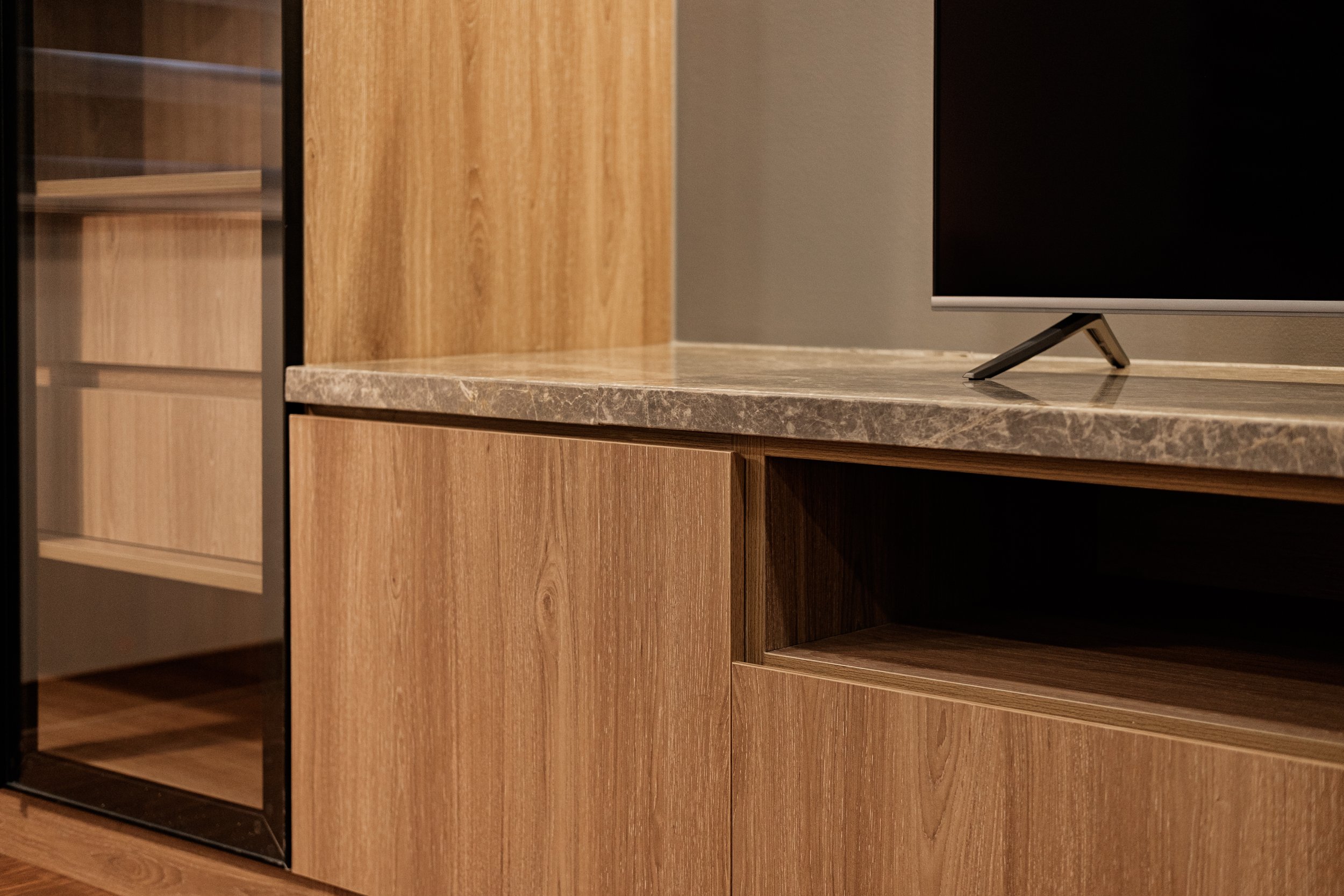
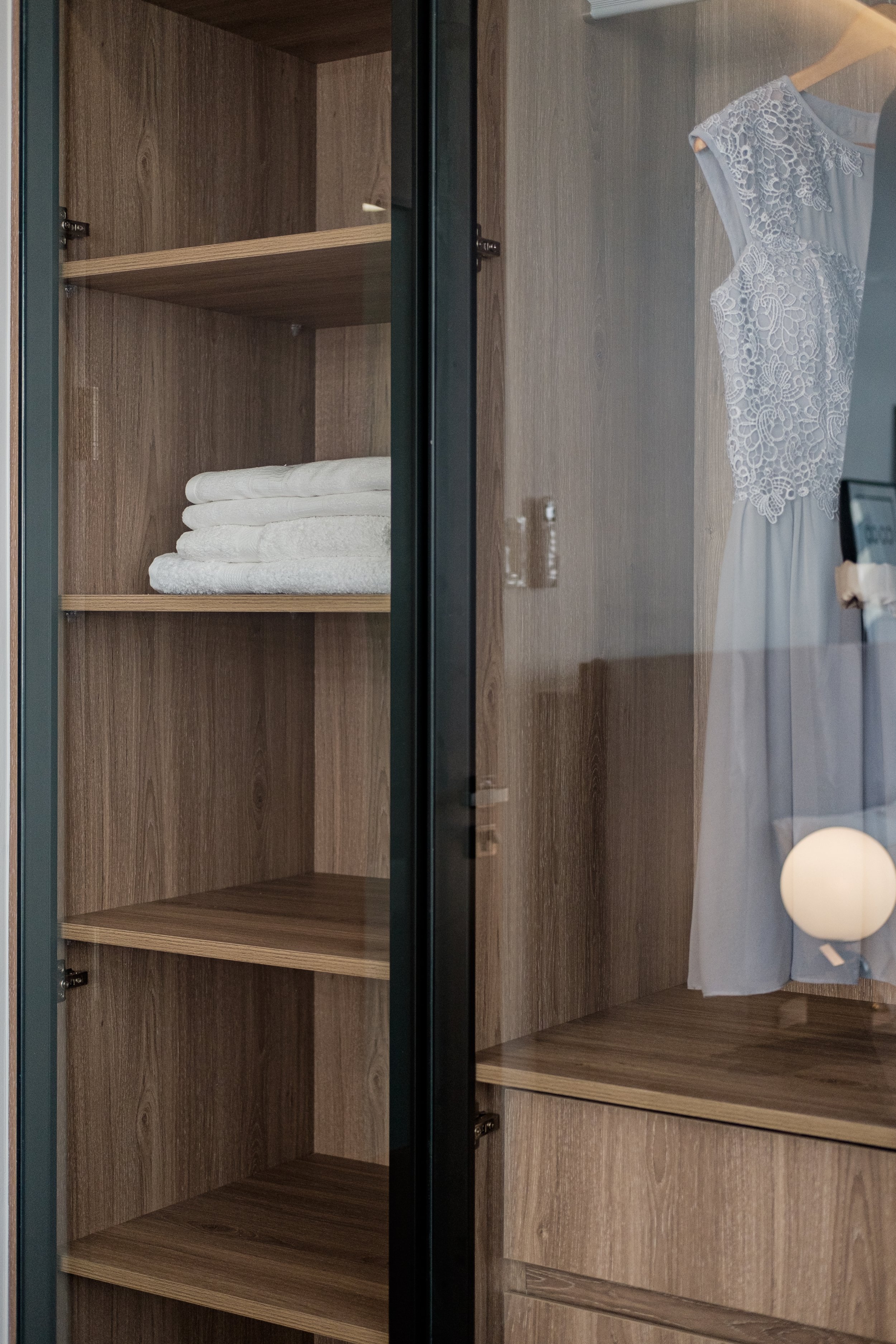
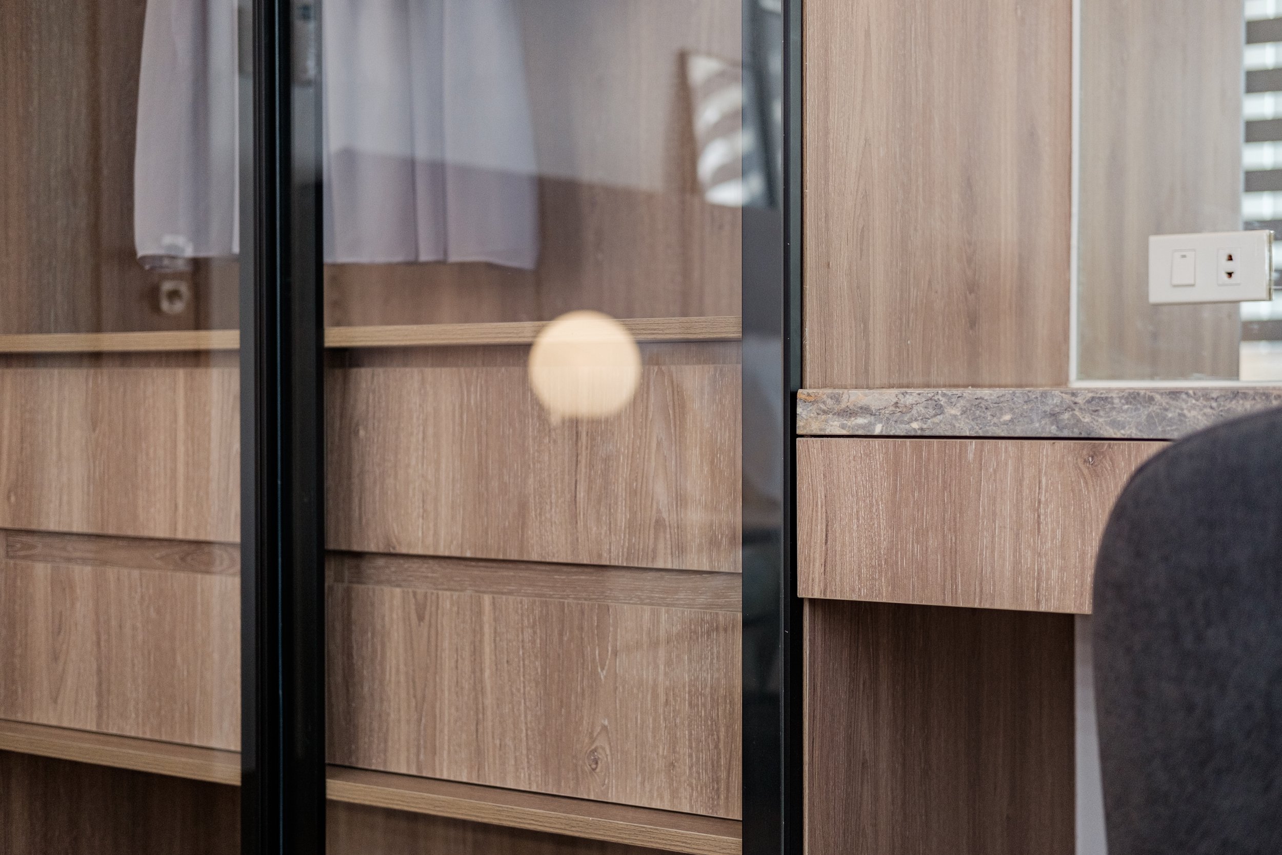
On the opposite view, the closet is built-in together with the AV unit in one seamless installation. We used clear glass to add depth to the unit and to also showcase the well-curated contents of the closet.
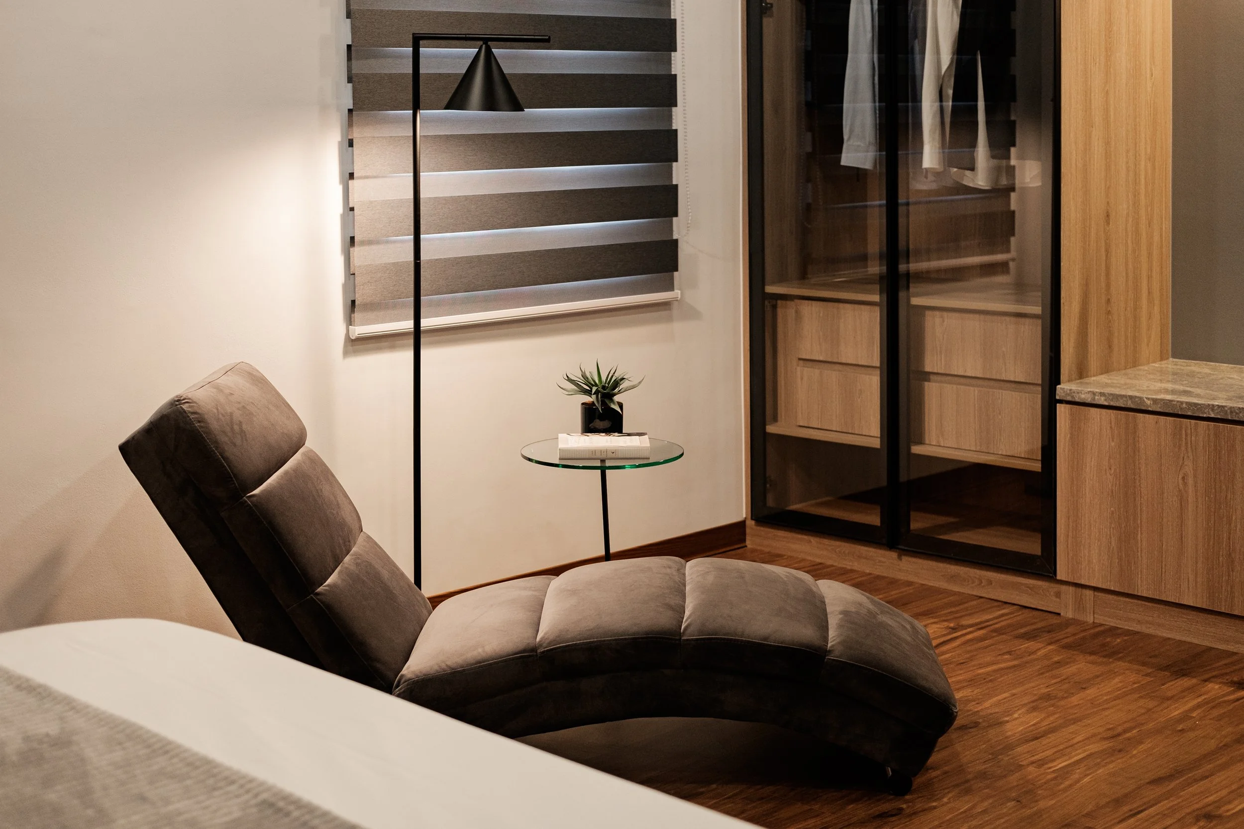
On the side, we have the perfect trinity for a reading vignette: a down light floor lamp, a side table for drinks and décor, and the Slinky chair which is the perfect piece to read or simply lounge in.


Guest Room
The guest bedroom is designed with a minimalist, chic persona in mind. In contrast to the master bedroom, the guest room is a light and toned-down version of a feminine glam space. We used silver mirrors and minimalist, fashion decor to give the space that chic character.
Lines are again a very prominent element as seen in the padded headboard, mirrored drawers, window treatments, and closet, but the pair of round night lamps contrasts them perfectly.


Most Memorable Experience
The overall design process was challenging and memorable, because we had to work around a lot of the limitations of the existing house like the structural elements, repurposing from residential to mixed-use, and updating the construction standards. We were challenged to think of different ways to update the space without just tearing everything down, and instead allowing the renovated space to still have that connection to its past.
We enjoyed seeing how different treatments to each limitation can co-exist to produce a distinct space. We are very grateful to the client for giving us the time and freehand to design the spaces accordingly; and we tried our best to work around the things that we can change to remove the dated look of the space and give it a second chance at life.
Contact the Interior Designer
IDr. Jeselyn Chuan
Mobile: +63917 866 7015
jeselynchuan.contactin.bio
Facebook: Interiors by Jes Chuan
Instagram: @jes_chuan