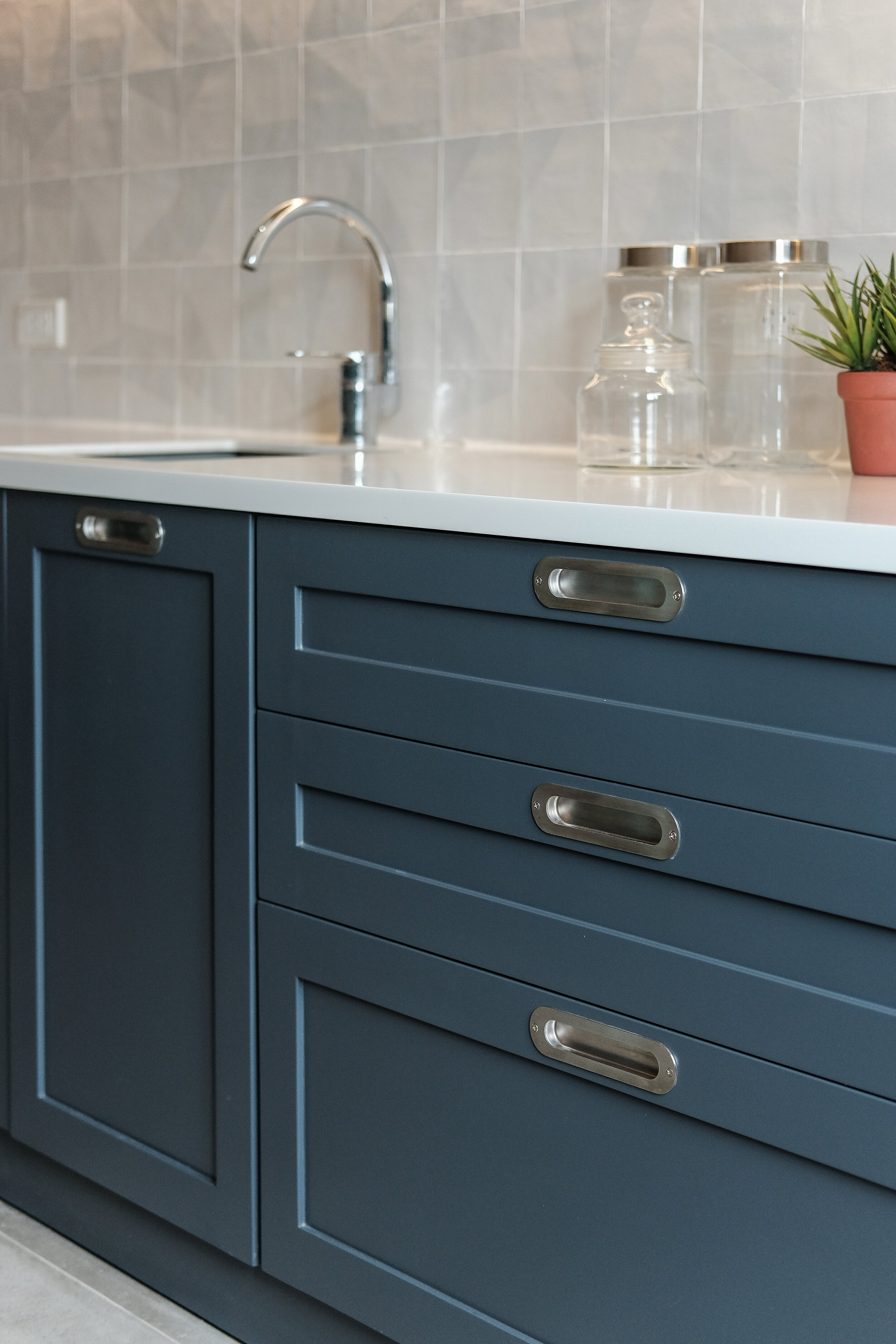
Intelligent Skin Care, Inc. Office (Belo Essentials)
Design and Words by IDr. Jiselle Yu of Jiselle Yu Interiors
Project location: Makati City, Philippines
Floor Area: 360 square meters
Inspiration
We wanted to achieve a more modernized look for their new office by using playful elements, different textures and materials especially since most of the staff belongs to the younger age group. We weren't afraid to use a lot of muted and bold colors to make the office have an uplifting and creative vibe.
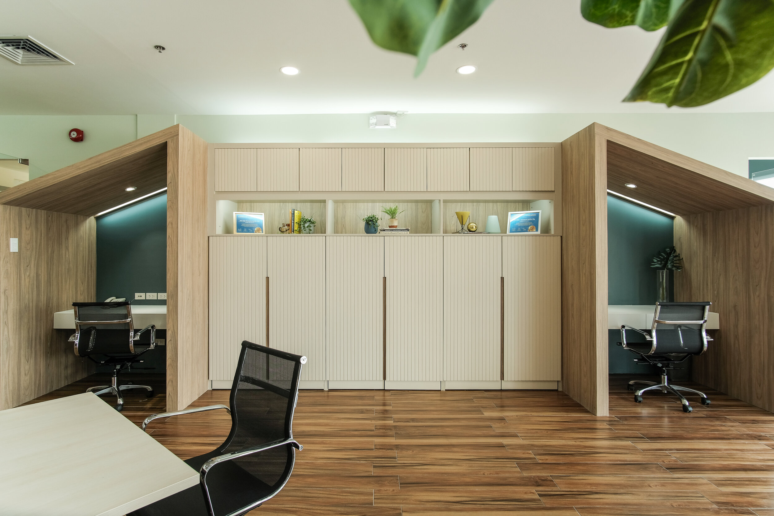
Since their company is all about beauty and skin care, we wanted to create a space with a feminine flair as well. In terms of layout, the clients wanted to create different work areas that follow pandemic protocols which is mainly, social distancing. If you noticed, the whole office is divided into rooms or mini work stations.

Lift Lobby
Focal point for the lift lobby is the marble wall surrounded by the vertical wood slats to add texture which we love using in our designs. This was the first time we made it white which gives off a clean aesthetic look.

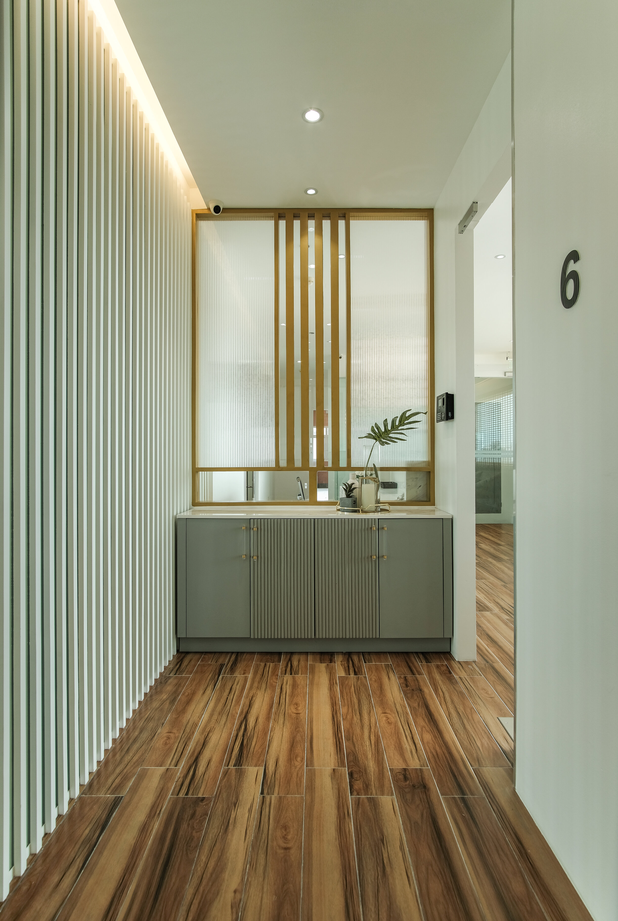
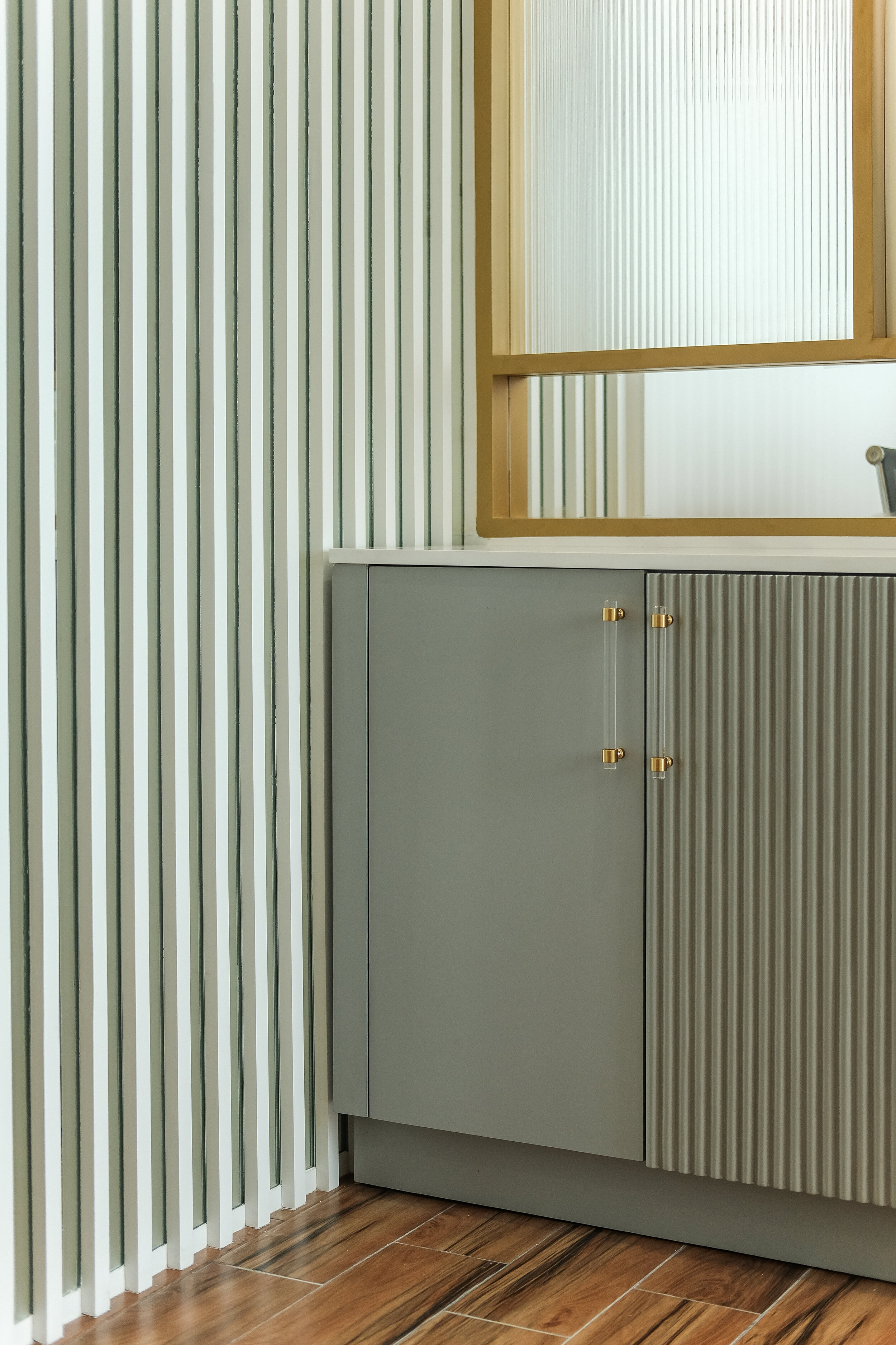
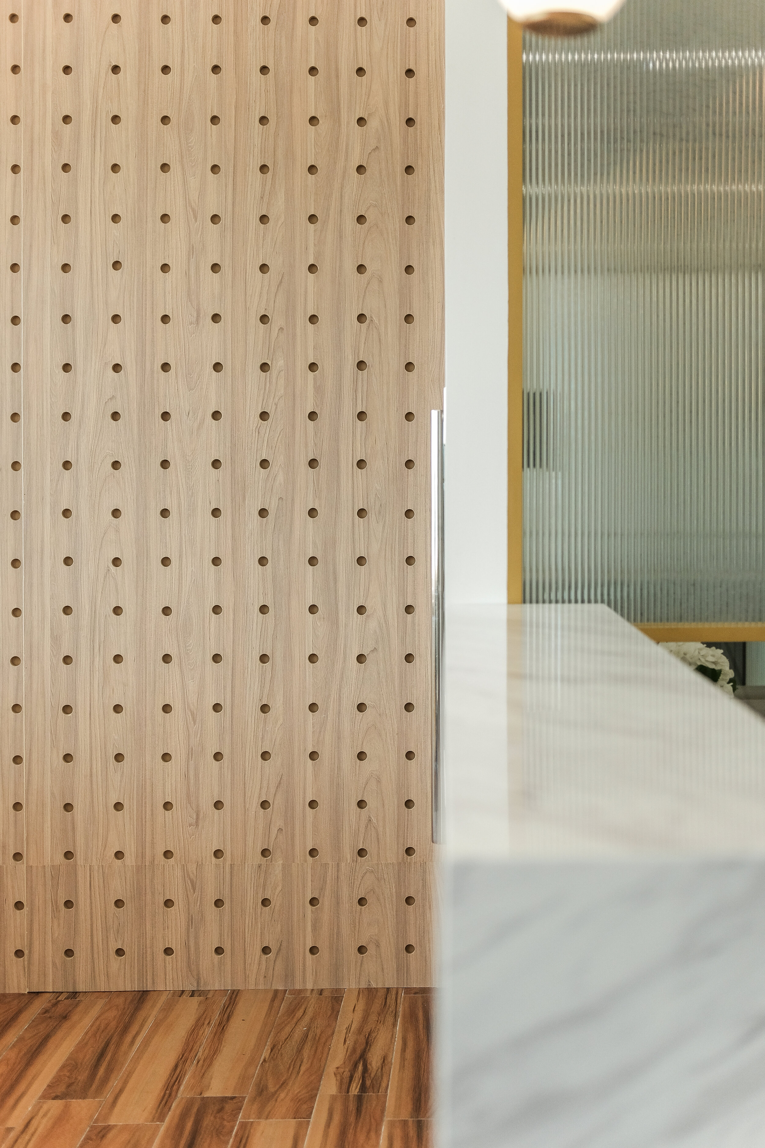
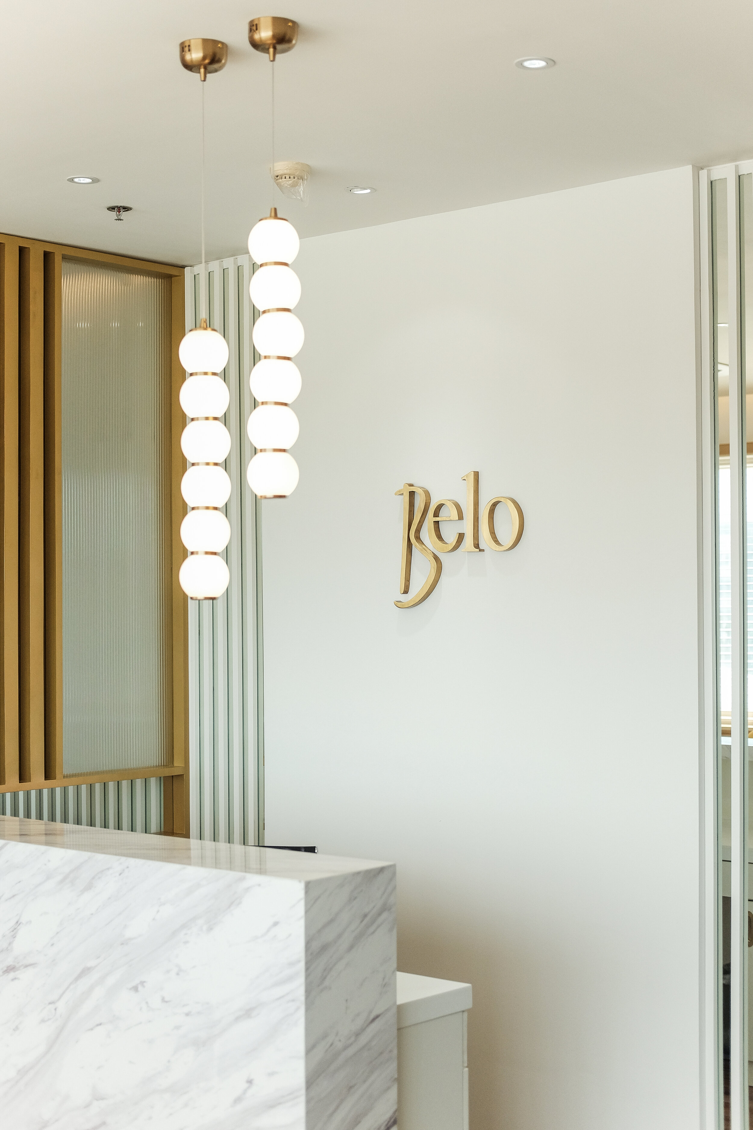
Reception
The white marble that was used in the lift lobby was incorporated at the design of the reception area as well so that there is a sense of cohesiveness and continuity between these two spaces. We also have a wooden wall with perforated circular patterns, as a brief preview of our design inside the main office.
We are also lucky that the clients' old furniture complimented our interiors that's why we were able to reuse some of it. We especially love the pop of yellow from the arm chair. The palm plant we placed in the area is an air purifying indoor plant which gives off a refreshing and relaxing vibe along with the wooden blinds at the windows.


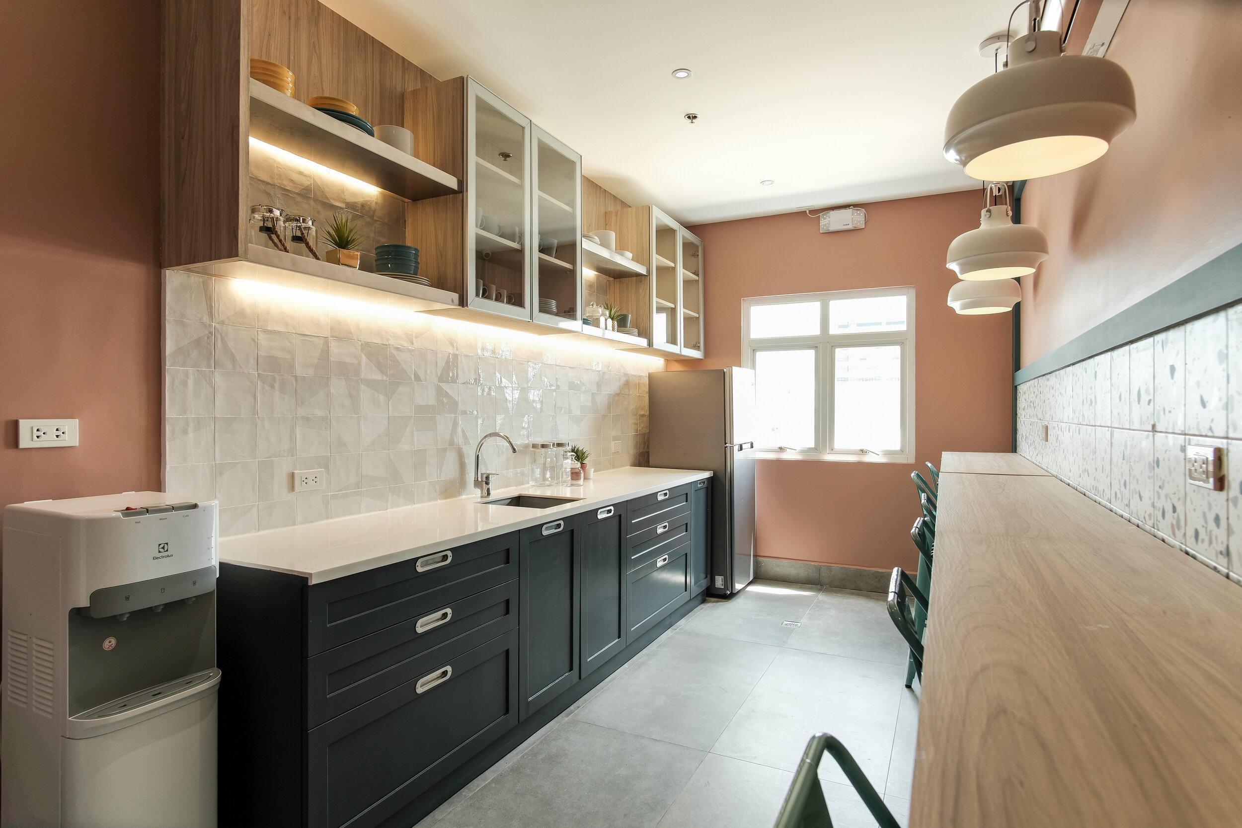
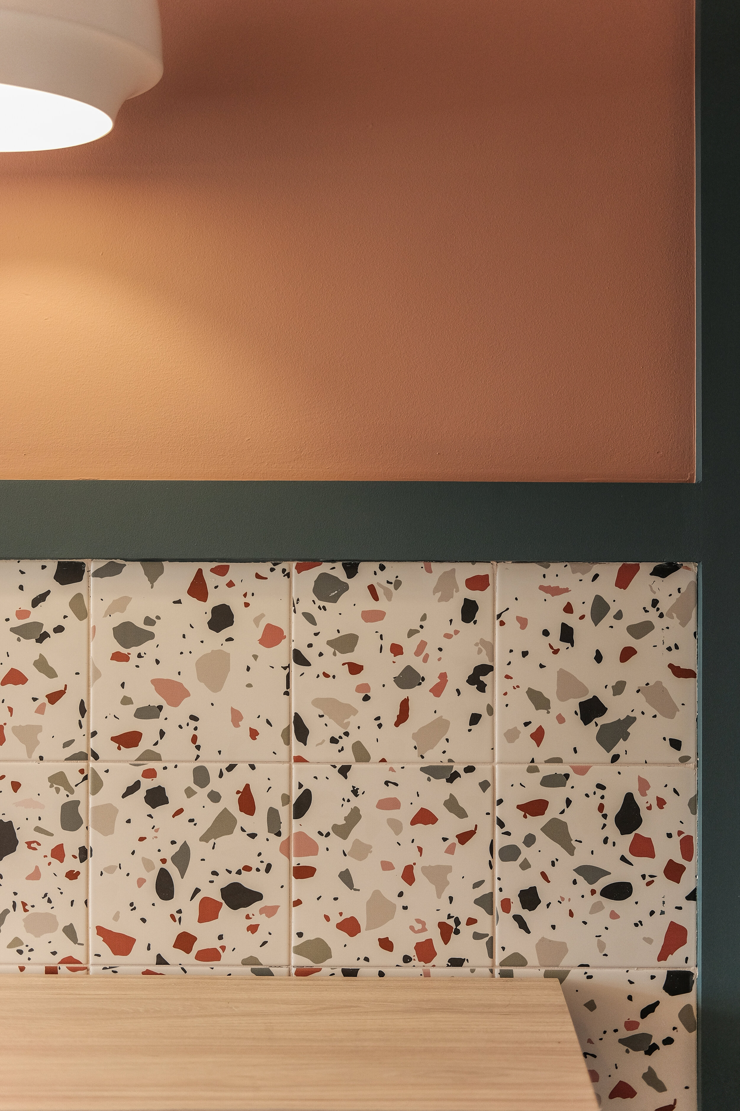
Pantry
Colorful terrazzo tiles were used as the wall accent in this space. The terrazzo tiles by the bar table also makes the wall below easier to clean in case it gets dirty since it is close to where someone’s feet will be while seated by the bar table. We then painted the upper wall with a bold pink color framed in a teal wood border. We just loved to color block all throughout this project!


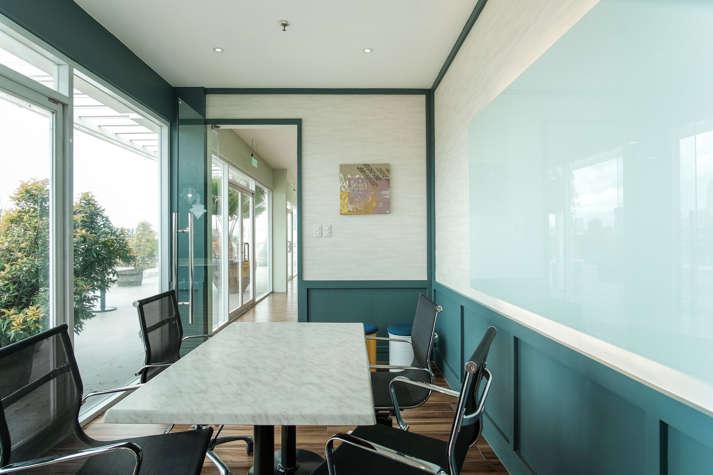
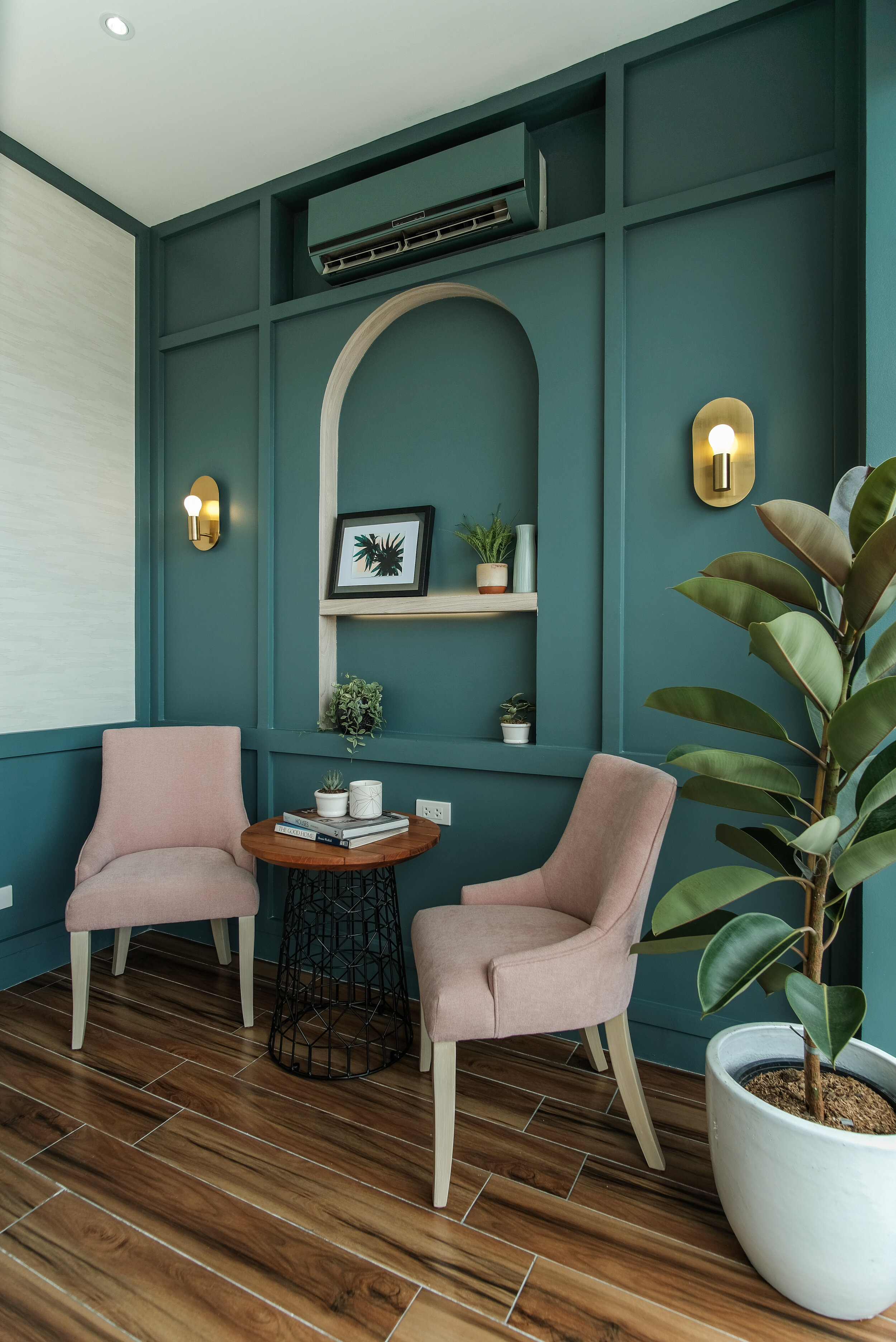
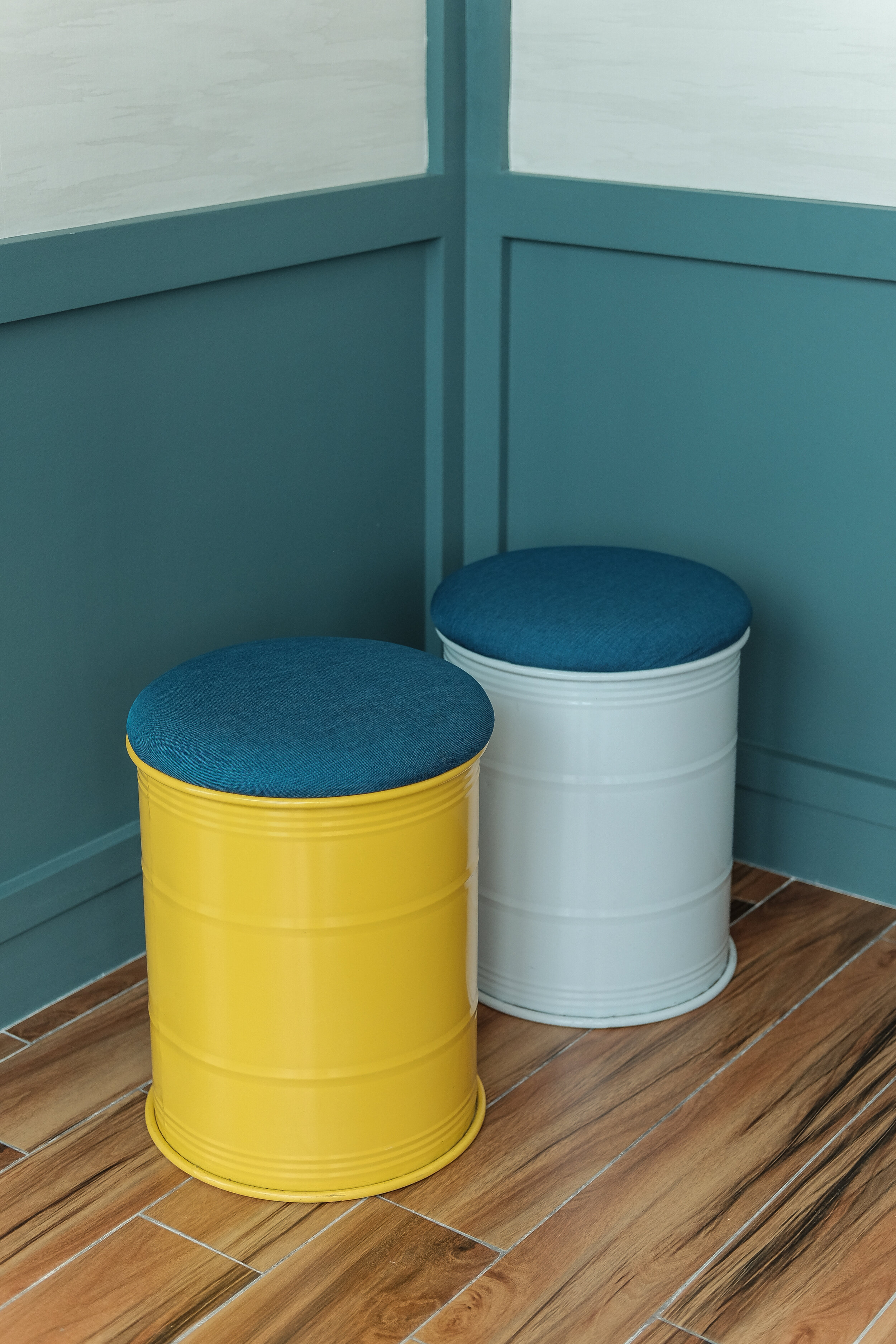
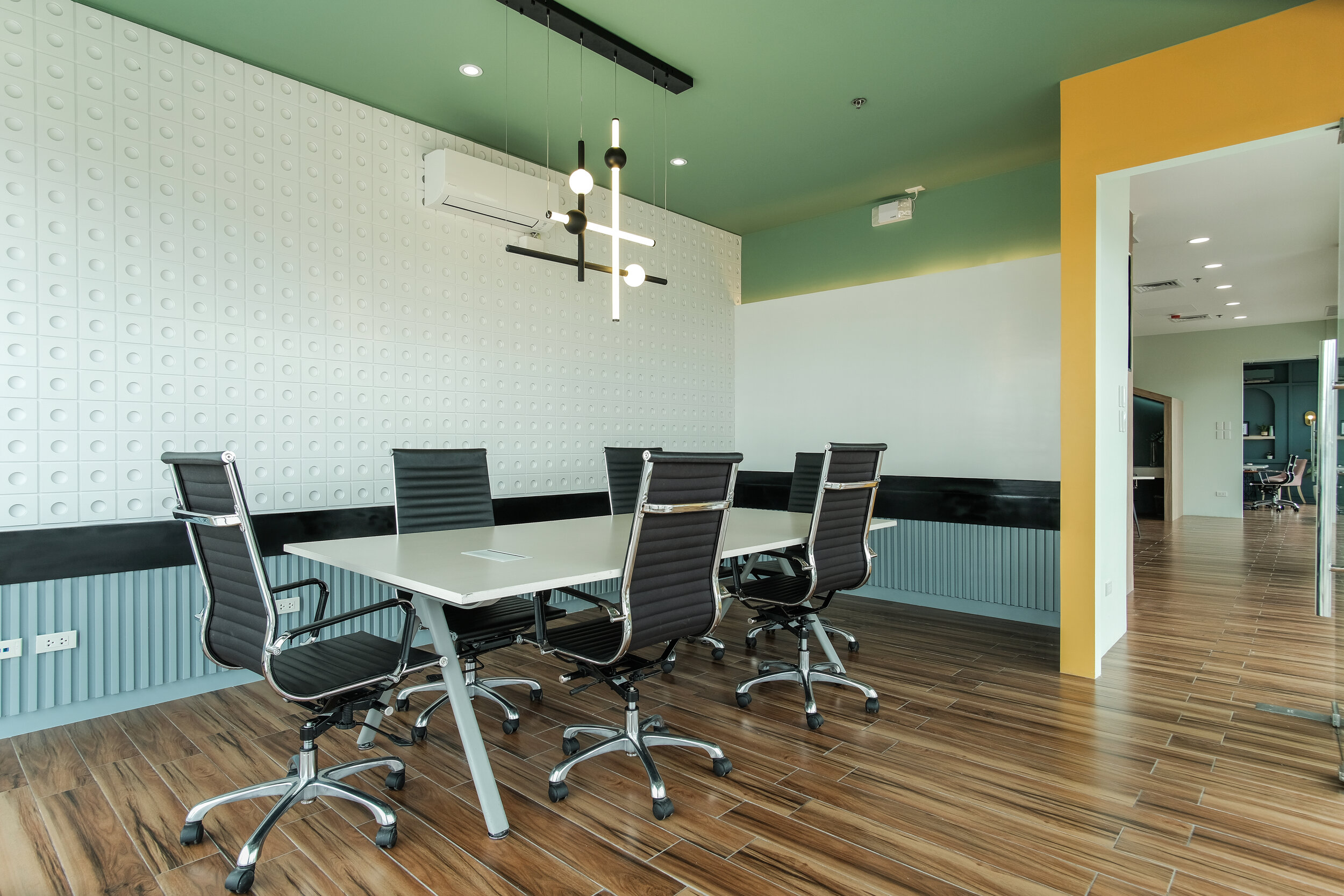
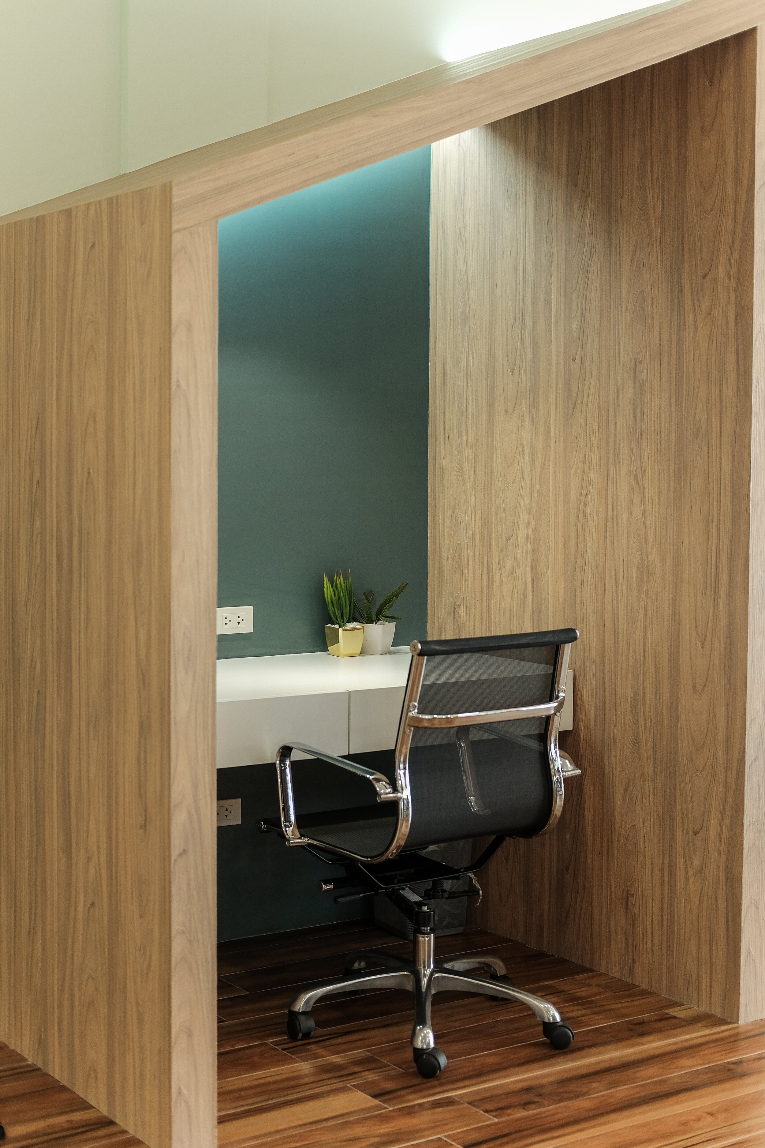
Zoom Room
The arched teal wall was complimented by the minimalist brass wall lamps and the textured wall paper we used. For the other walls, low teal moldings were also added to make the room look taller. Of course we had to add the plant inside as well since this room is very well lit and it gets a lot of natural sunlight.


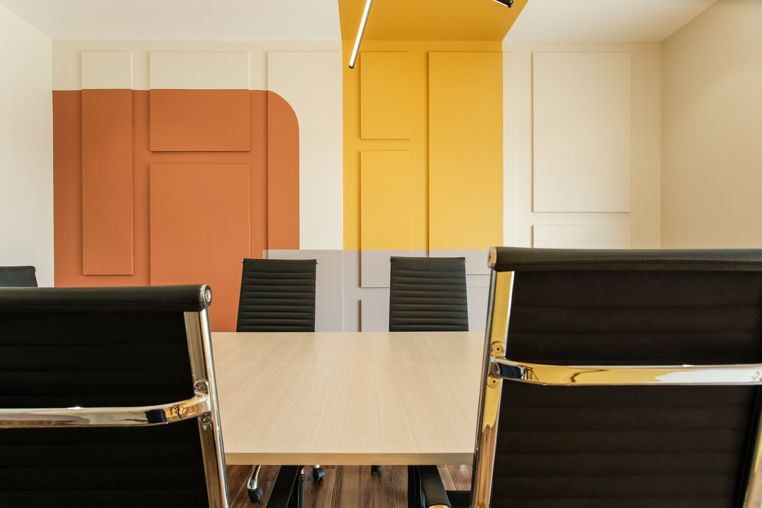
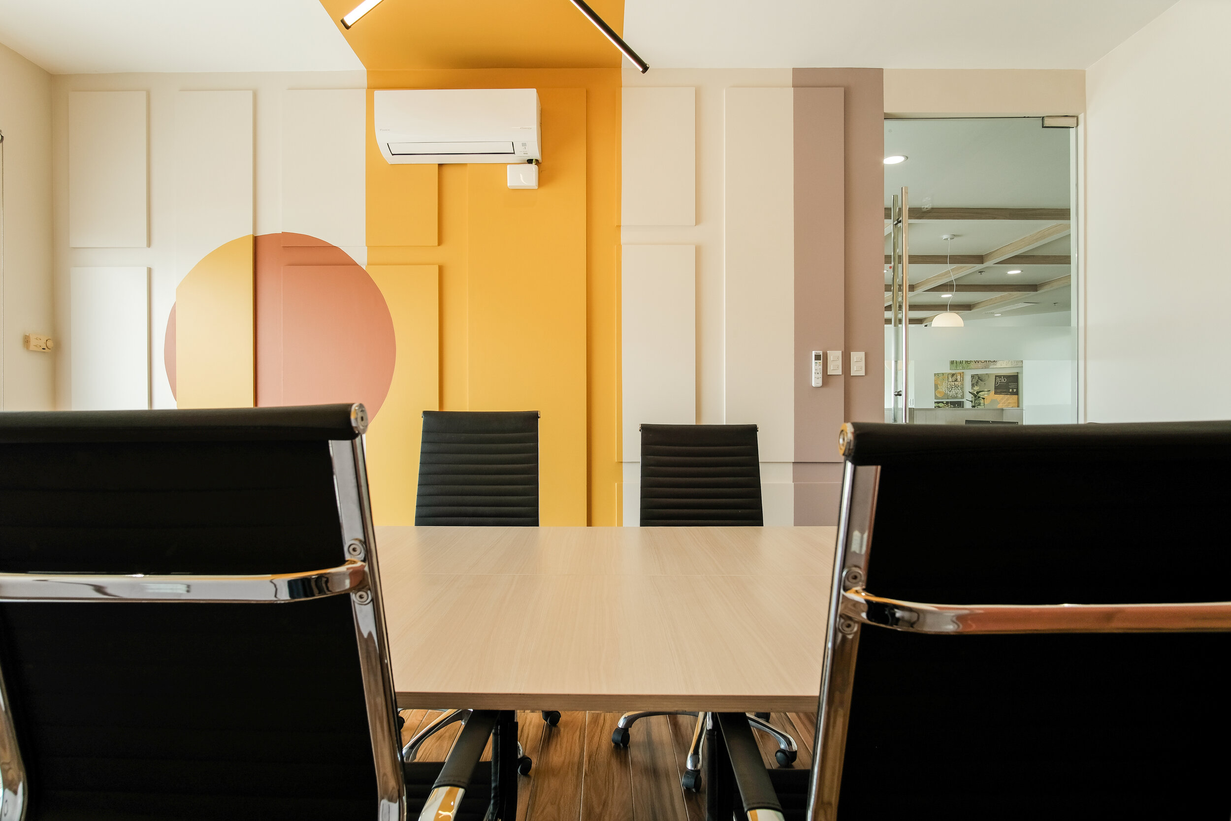
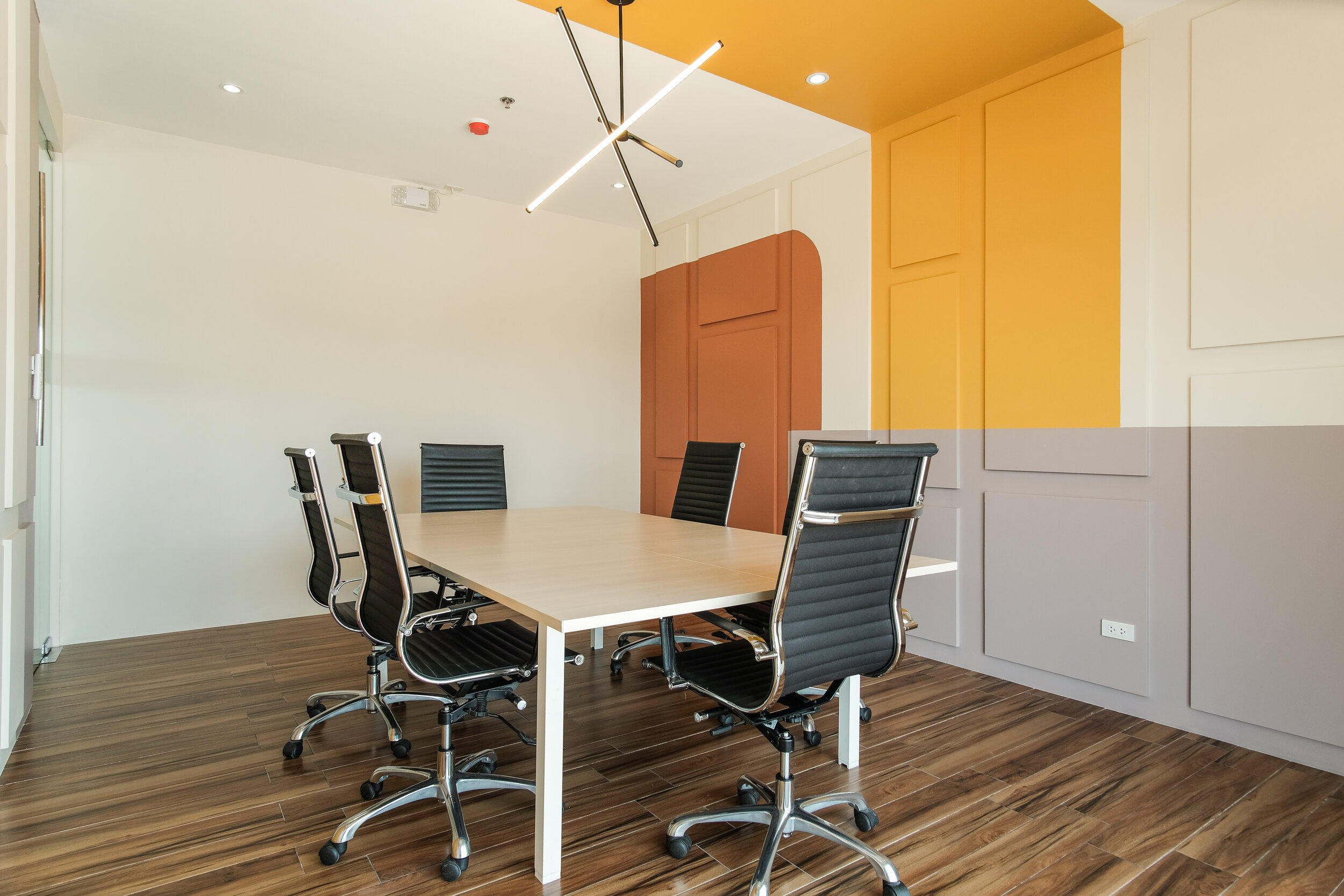
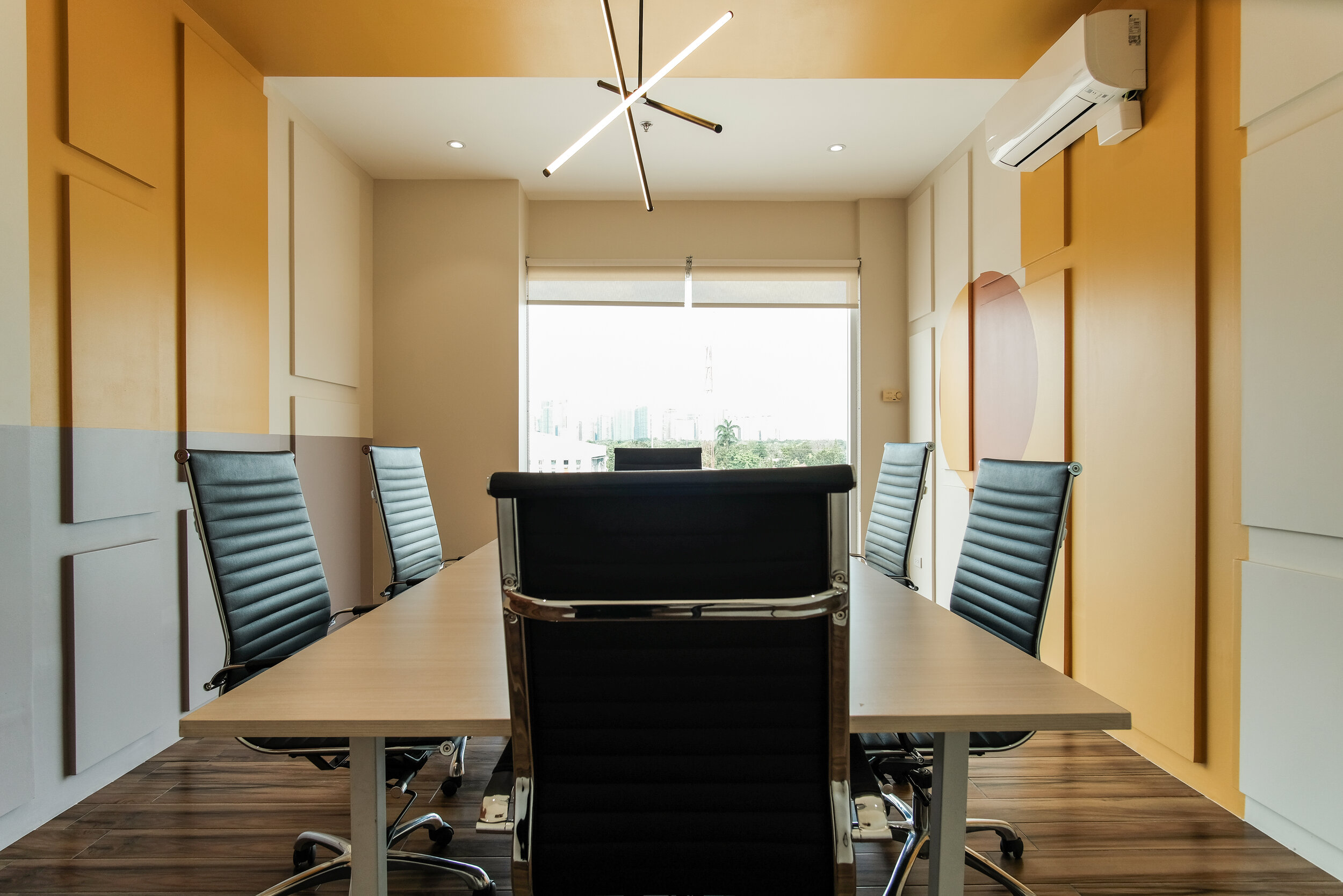
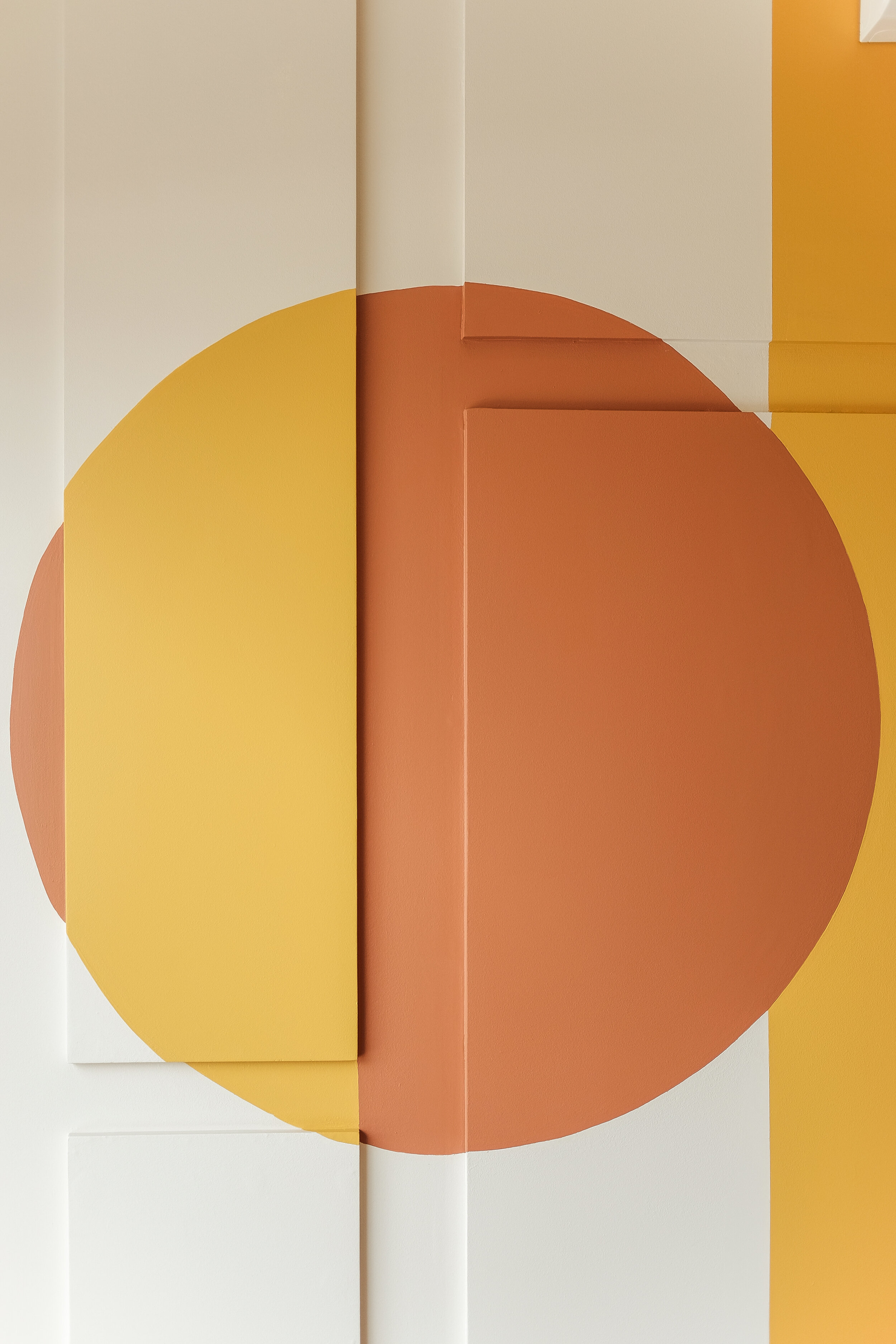
Meeting Room 1
For this room, we played around with shapes and colors. We did embossed rectangular panels in random sizes and then painted over it a mix of these three colors which we LOVE! Who would have thought that red orange, yellow and lavender could go together so well?


Meeting Room 2
We wanted to concentrate again on texture but of course it had to be something different. Hence, the textured white wall with circular patterns. Would you believe that this was done manually by our contractor? Initially we wanted to have it laser cut but it was too expensive. We had to have mock ups done to make sure we get the perfect size of the circle and the correct spacing in between circles. The color scheme for the rooms is mostly black and white, accentuated with a light powder blue color.


Boss’s Office
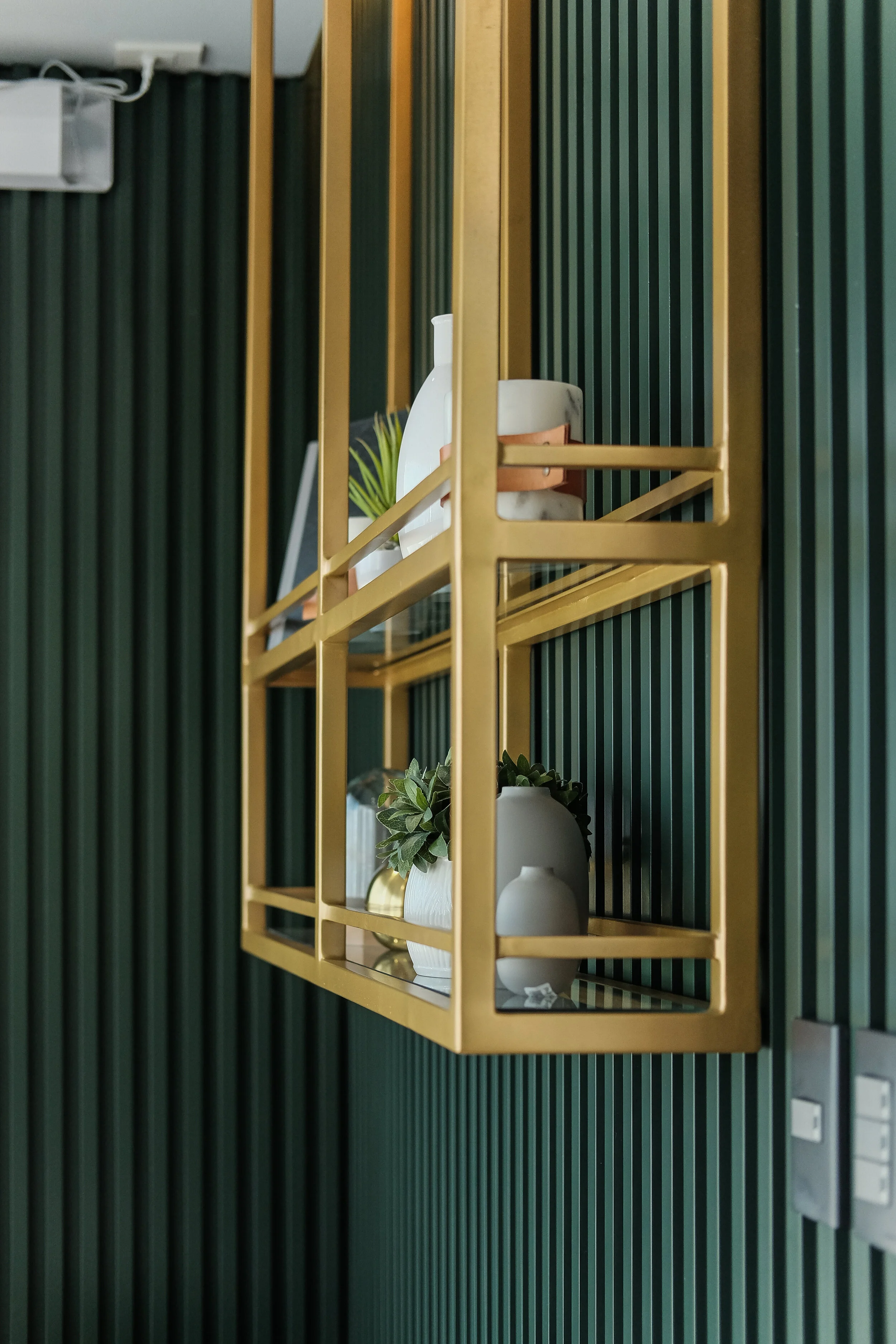
For this room, we used a rich dark green color painted on vertical wood slats. We also used a black mirror accent on one of the walls to add more depth to the design. The mixture of dark green with the black mirror gives off a more formal vibe which is perfect for a “Boss’s Office.”


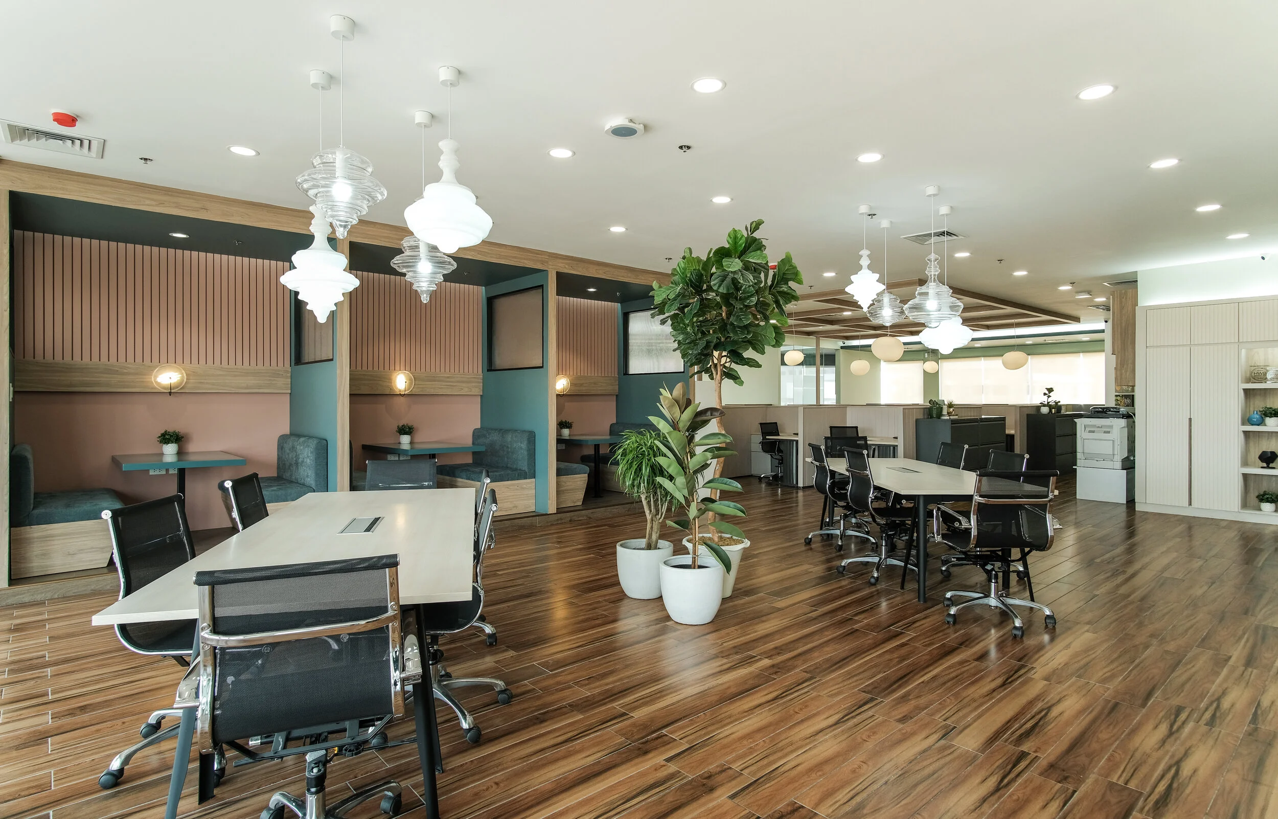
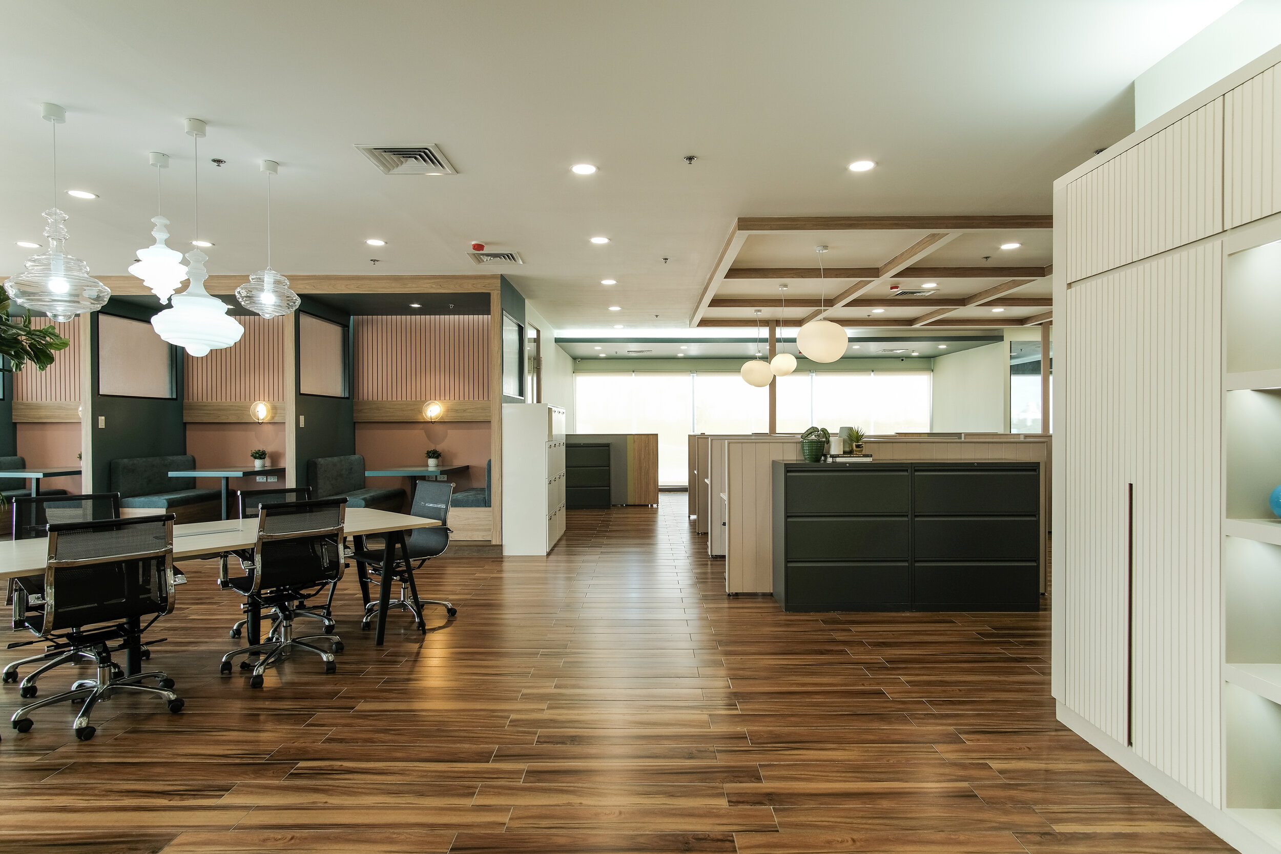
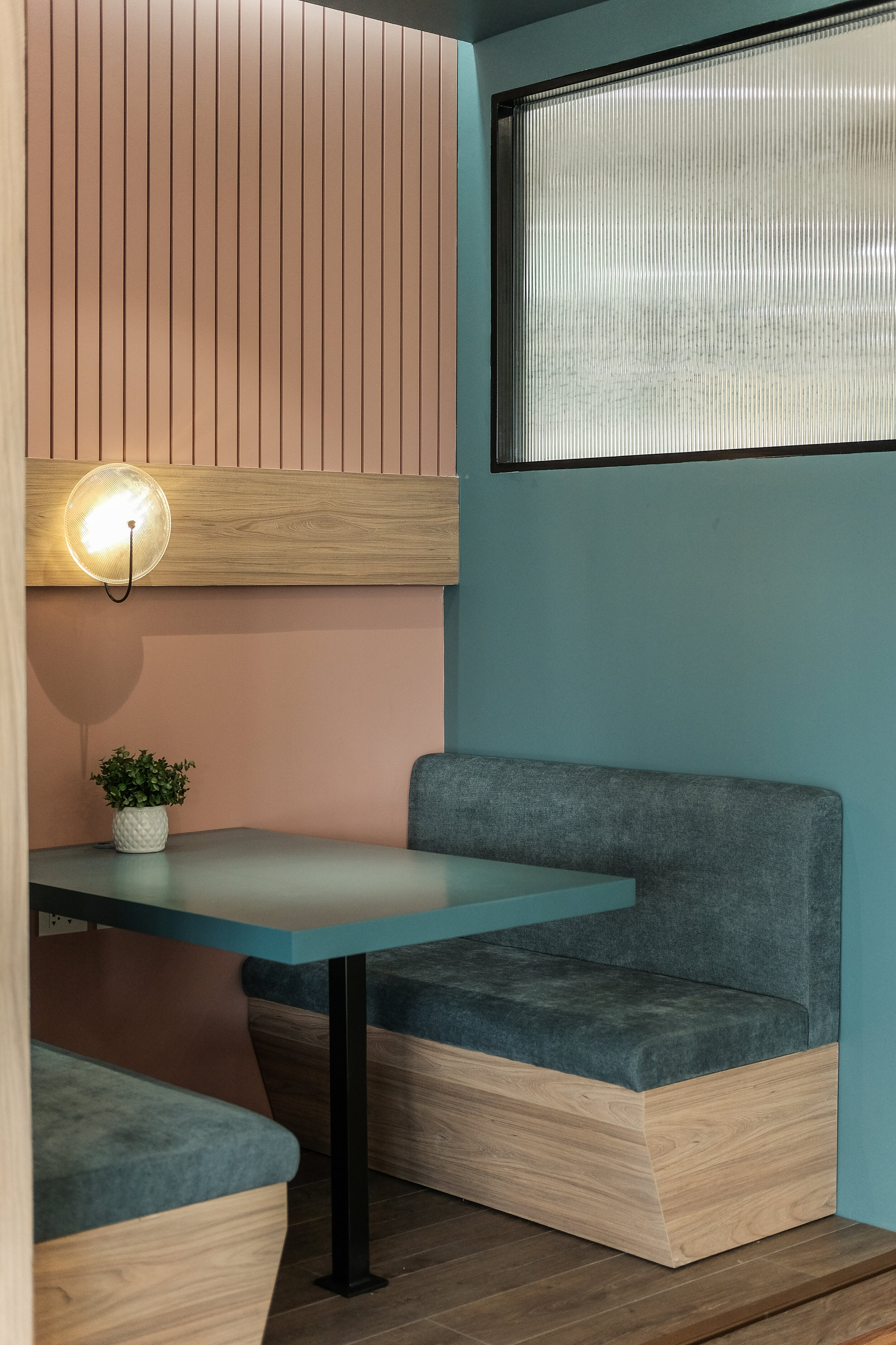
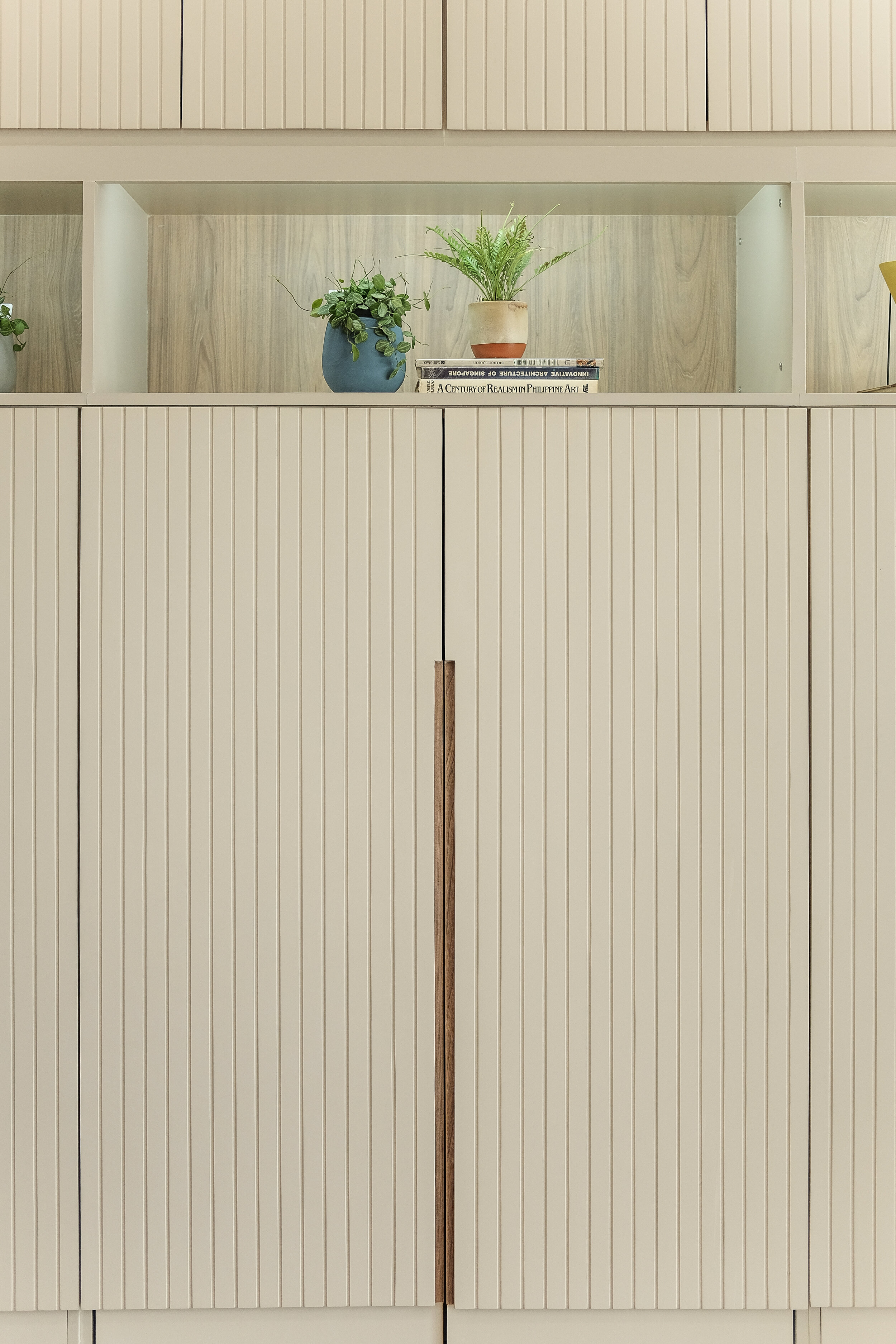
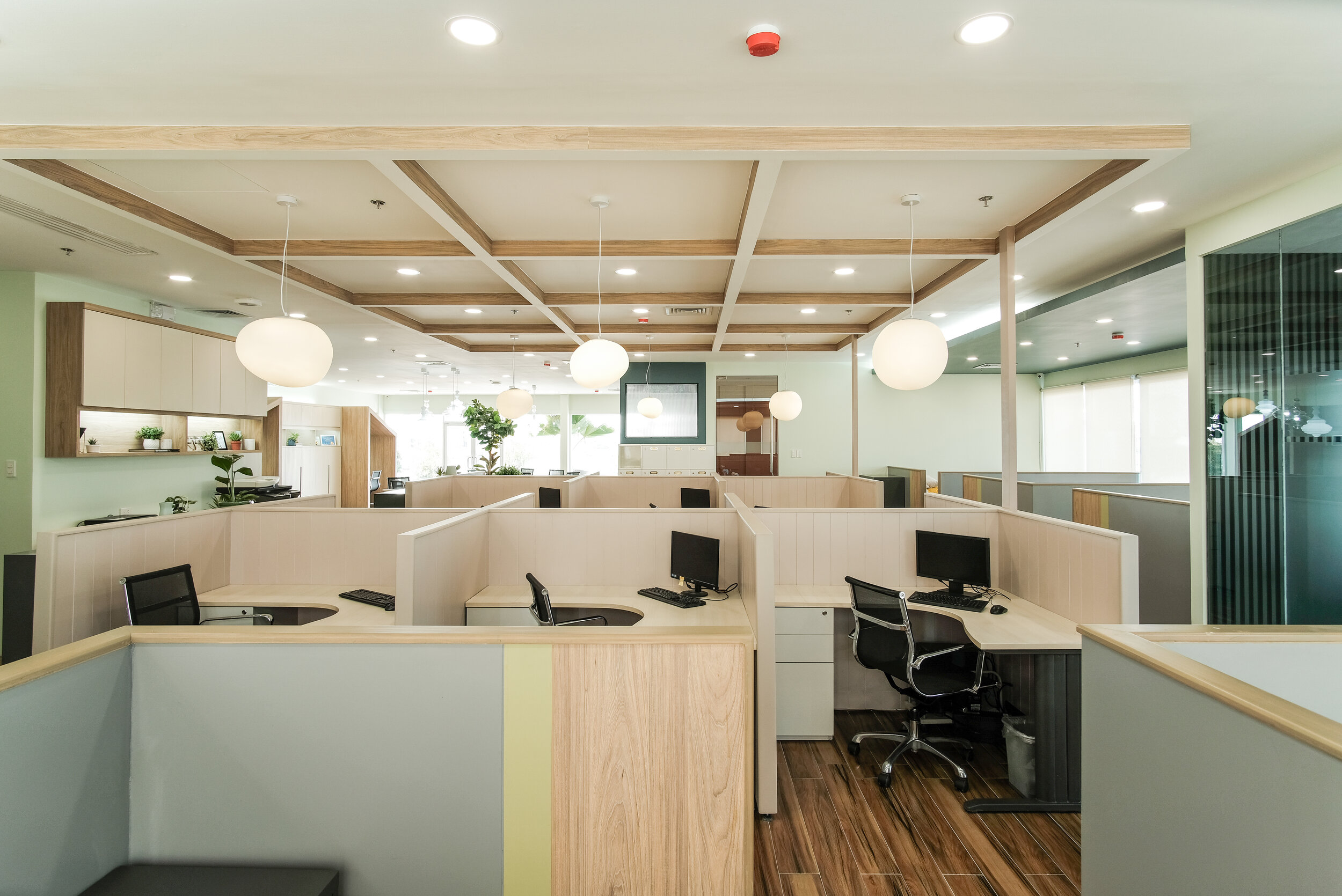
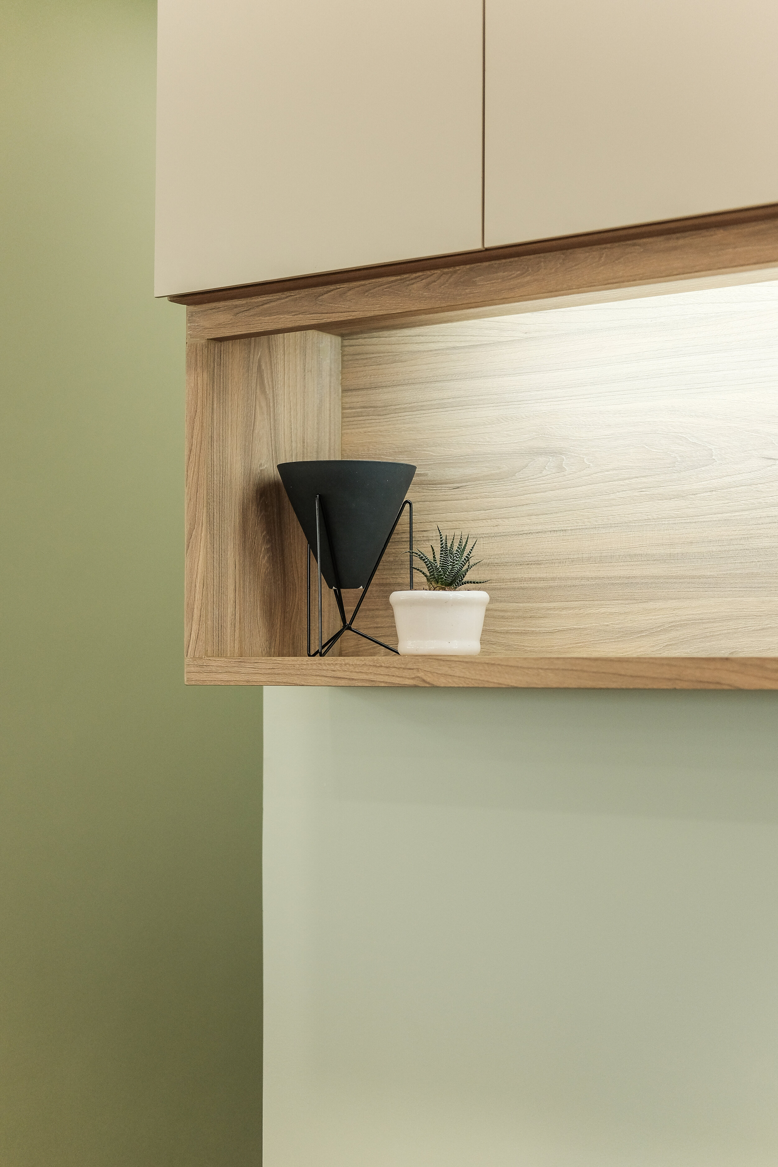
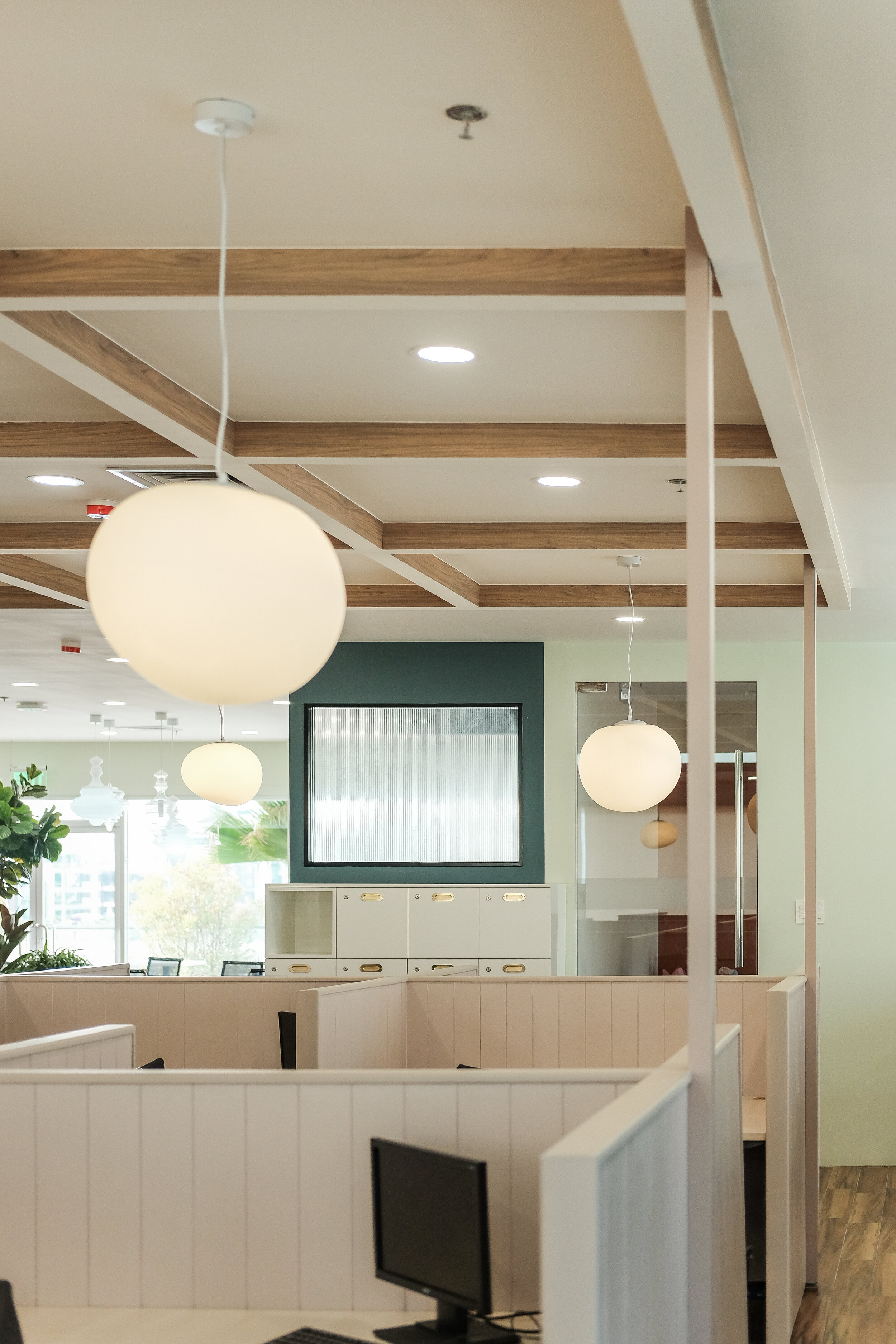
Office Area
Our favorite feature in the office area is the booth seating. We did color blocking for this as well with pinks and blues. For the overall area, most of the colors used were in the muted spectrum and neutrals mixed with wood accents to give a more refreshing, light and airy vibe. We also loved the huge tree plant in the middle of our accent Moroccan like lamps.


Most Memorable Experience
One of the most memorable experiences during this project is when we had to pick the perfect shades for our walls. It was fun but very challenging because we were very specific with the colors that we want to achieve and there were a lot of colors that we wanted to use. The thing with referencing to paint codes via fan swatches is that it will look different once applied on the walls. It is very important to do color swatching especially with bold colors to make sure you get the correct shade.
Also, using a mixture of different colors, materials and textures is a big risk since it can really make or break the whole design. It was a very tedious process for the whole team but we just love to use various elements in our design. We were very specific in planning everything even up to the smallest details, and looking at it now, we could say that everything was worth it because it turned out exactly the way we envisioned it to be.

Contact the Interior Designer
IDr. Jiselle Yu of Jiselle Yu Interiors
Email: jiselleinteriors@gmail.com
Instagram: @jiselleyu.interiors
Facebook: Jiselle Yu Interiors